 |
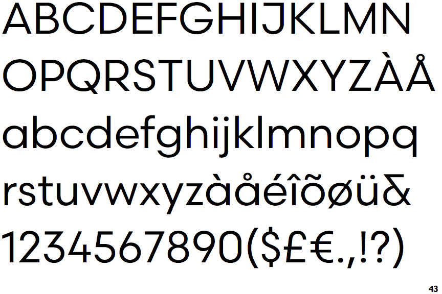
The '&' (ampersand) is traditional style with a gap at the top.
|
 |
The '4' is open.
|
 |
The diagonal strokes of the upper-case 'K' meet at the vertical (with or without a gap).
|
 |
The dot on the '?' (question-mark) is circular or oval.
|
 |
The top storey of the '3' is a sharp angle.
|
 |
The upper-case 'J' has a bar to the left.
|
 |
The centre bar of the upper-case 'R' meets the vertical.
|
 |
The dot on the lower-case 'i' or 'j' is circular or oval.
|
 |
The tail of the upper-case 'Q' is straight.
|
 |
The upper-case 'M' vertices are flat at the top, pointed at the bottom.
|
Note that the fonts in the icons shown above represent general examples, not necessarily the two fonts chosen for comparison.
Show Examples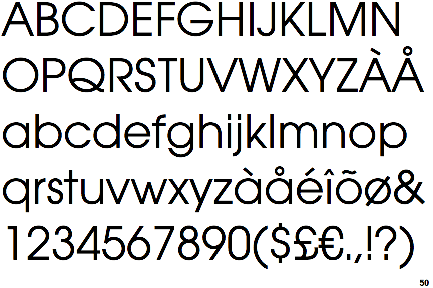
 |
The '&' (ampersand) is traditional style with two enclosed loops.
|
 |
The '4' is closed.
|
 |
The diagonal strokes of the upper-case 'K' meet in a 'T'.
|
 |
The dot on the '?' (question-mark) is square or rectangular.
|
 |
The top storey of the '3' is a smooth curve.
|
 |
The upper-case 'J' has no bar.
|
 |
The centre bar of the upper-case 'R' leaves a gap with the vertical.
|
 |
The dot on the lower-case 'i' or 'j' is square or rectangular.
|
 |
The tail of the upper-case 'Q' is curved or S-shaped.
|
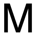 |
The upper-case 'M' vertices are flat at the top and bottom.
|