Identifont

Fonts by Appearance

Fonts by Name

Fonts by Similarity

Fonts by Picture

Fonts by Designer/Publisher

Differences

TweetTweet Differences

Compare: and  

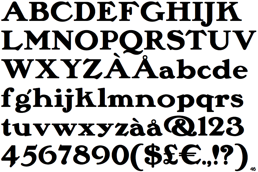
Saturday Morning Toast NF

Saturday Morning Toast NF

Above
The centre vertex of the upper-case 'M' is above the baseline.
Parallel
The verticals of the upper-case 'M' are parallel.
Meets
The centre bar of the upper-case 'P' meets the vertical.
Spur
The upper-case 'G' foot has a downward pointing spur.
Horizontal
The lower-case 'e' has a straight horizontal bar.

Note that the fonts in the icons shown above represent general examples, not necessarily the two fonts chosen for comparison.

Show Examples
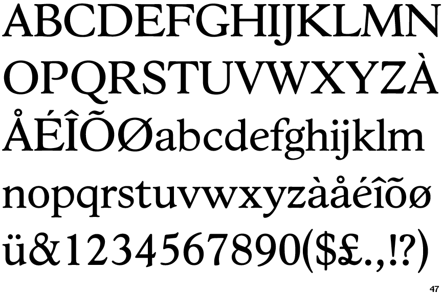
Hess Old Style

Hess Old Style

Baseline
The centre vertex of the upper-case 'M' is on the baseline.
Sloping
The verticals of the upper-case 'M' are sloping.
Gap
The centre bar of the upper-case 'P' leaves a gap with the vertical.
No-Spur
The upper-case 'G' foot has no spur or serif.
Sloping
The lower-case 'e' has a straight angled bar.