Identifont

Fonts by Appearance

Fonts by Name

Fonts by Similarity

Fonts by Picture

Fonts by Designer/Publisher

Differences

TweetTweet Differences

Compare: and  

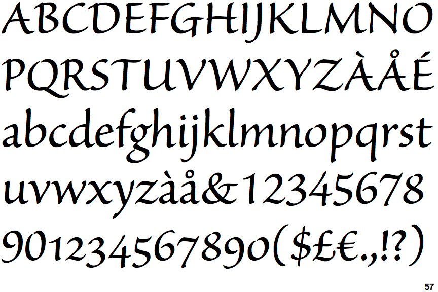
Sanvito Subhead

Sanvito Subhead

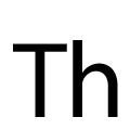
Sans-serif
The characters do not have serifs.
Open
The '4' is open.
Round
The top storey of the '3' is a smooth curve.
Meets
The centre bar of the upper-case 'P' meets the vertical.
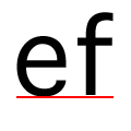
On
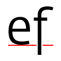
The tail of the lower-case 'f' sits on the baseline.
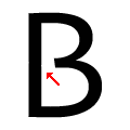
Gap
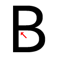
The centre bar of the upper-case 'B' leaves a gap with the vertical.

Note that the fonts in the icons shown above represent general examples, not necessarily the two fonts chosen for comparison.

Show Examples
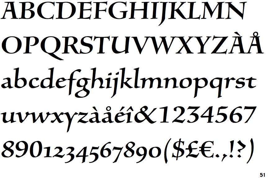
Silentium I

Silentium I

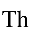
Serif
The characters have serifs.
Closed
The '4' is closed.
Angled
The top storey of the '3' is a sharp angle.
Gap
The centre bar of the upper-case 'P' leaves a gap with the vertical.
Below
The tail of the lower-case 'f' descends below the baseline.
Meets
The centre bar of the upper-case 'B' meets the vertical.