Identifont

Fonts by Appearance

Fonts by Name

Fonts by Similarity

Fonts by Picture

Fonts by Designer/Publisher

Differences

TweetTweet Differences

Compare: and  

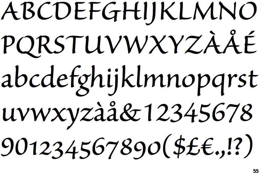
Sanvito

Sanvito

Below
The upper-case 'J' descends below the baseline.
Sans-serif
The characters do not have serifs.
Open
The '4' is open.
Meets
The centre bar of the upper-case 'P' meets the vertical.
Stem
The upper-case 'U' has a stem/serif.
Closed
The centre bar of the upper-case 'R' meets the vertical.

Note that the fonts in the icons shown above represent general examples, not necessarily the two fonts chosen for comparison.

Show Examples
Waters Titling

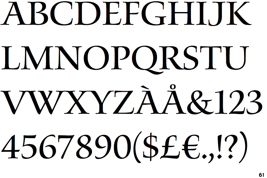
Waters Titling

On
The upper-case 'J' sits on the baseline.
Serif
The characters have serifs.
Closed
The '4' is closed.
Gap
The centre bar of the upper-case 'P' leaves a gap with the vertical.
No-Stem
The upper-case 'U' has no stem/serif.
Open
The centre bar of the upper-case 'R' leaves a gap with the vertical.