 |
The upper-case 'Q' tail touches the circle.
|
 |
The lower-case 'a' stem stops at the top of the bowl (single storey).
|
 |
The 'l' (lower-case 'L') has a left-facing upper serif.
|
 |
The upper-case 'J' has a bar to the left.
|
 |
The sides of the lower-case 'y' are parallel (U-shaped).
|
 |
The tail of the lower-case 'y' is curved or U-shaped to the left.
|
 |
The upper-case letter 'I' is plain.
|
 |
The lower-case 'i' has a left-facing upper serif.
|
 |
The verticals of the digit '0' are fully curved.
|
 |
The tail of the lower-case 'j' is curved with an upper serif.
|
Note that the fonts in the icons shown above represent general examples, not necessarily the two fonts chosen for comparison.
Show Examples
 |
The upper-case 'Q' tail crosses the circle.
|
 |
The lower-case 'a' stem curves over the top of the bowl (double storey).
|
 |
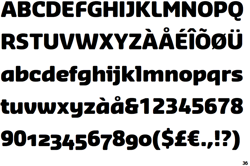
The 'l' (lower-case 'L') has no serifs or tail.
|
 |
The upper-case 'J' has no bar.
|
 |
The sides of the lower-case 'y' are angled (V-shaped).
|
 |
The tail of the lower-case 'y' is substantially straight.
|
 |
The upper-case letter 'I' has serifs/bars.
|
 |
The lower-case 'i' has no serifs or tail.
|
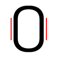 |
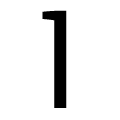
The verticals of the digit '0' have straight segments.
|
 |
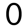
The tail of the lower-case 'j' is curved with no upper serif.
|