 |
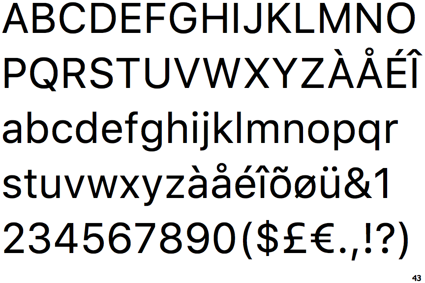
The right side of the upper-case 'G' is curved.
|
 |
The tail of the lower-case 'y' is curved or U-shaped to the left.
|
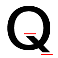 |
The ends of the upper-case 'Q' tail are both horizontal.
|
Note that the fonts in the icons shown above represent general examples, not necessarily the two fonts chosen for comparison.
Show Examples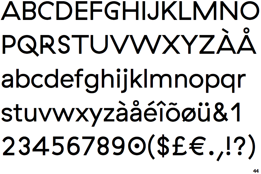
 |
The right side of the upper-case 'G' has a flat section.
|
 |
The tail of the lower-case 'y' is substantially straight.
|
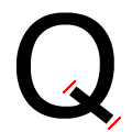 |
The ends of the upper-case 'Q' tail are both diagonal.
|