Identifont

Fonts by Appearance

Fonts by Name

Fonts by Similarity

Fonts by Picture

Fonts by Designer/Publisher

Differences

TweetTweet Differences

Compare: and  

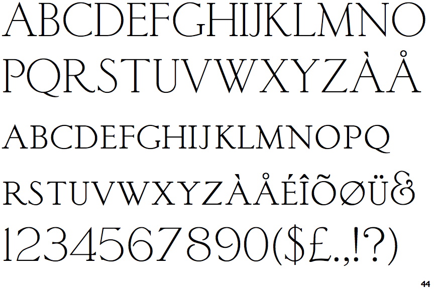
Sackers Light Classic Roman

Sackers Light Classic Roman

On
The upper-case 'J' sits on the baseline.
Double
The diagonal strokes of the upper-case 'K' meet in a 'T'.
No-Stem
The upper-case 'U' has no stem/serif.
Top serif
The top stroke of the upper-case 'C' has a vertical or angled upward-pointing serif.

Note that the fonts in the icons shown above represent general examples, not necessarily the two fonts chosen for comparison.

Show Examples
Classic Roman

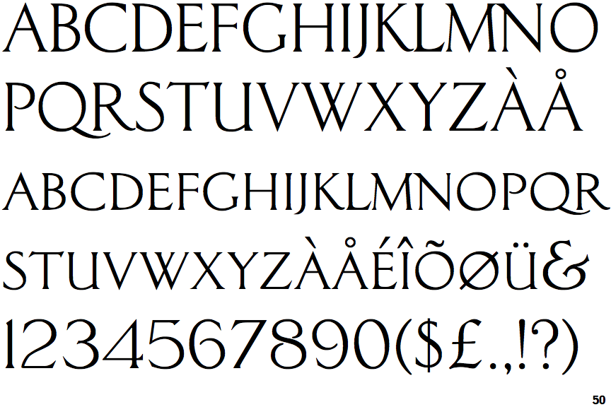
Classic Roman

Below
The upper-case 'J' descends below the baseline.
Single
The diagonal strokes of the upper-case 'K' meet at the vertical (with or without a gap).
Stem
The upper-case 'U' has a stem/serif.
No top serif
The top stroke of the upper-case 'C' has no upward-pointing serif.