Identifont

Fonts by Appearance

Fonts by Name

Fonts by Similarity

Fonts by Picture

Fonts by Designer/Publisher

Differences

TweetTweet Differences

Compare: and  

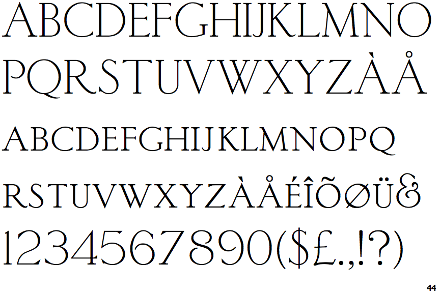
Sackers Light Classic Roman

Sackers Light Classic Roman

Touches
The upper-case 'Q' tail touches the circle.
Sloping
The verticals of the upper-case 'M' are sloping.
Gap
The centre bar of the upper-case 'P' leaves a gap with the vertical.
Top serif
The top stroke of the upper-case 'C' has a vertical or angled upward-pointing serif.
Four
The top of the upper-case 'W' has four upper terminals.

Note that the fonts in the icons shown above represent general examples, not necessarily the two fonts chosen for comparison.

Show Examples
Burin Roman

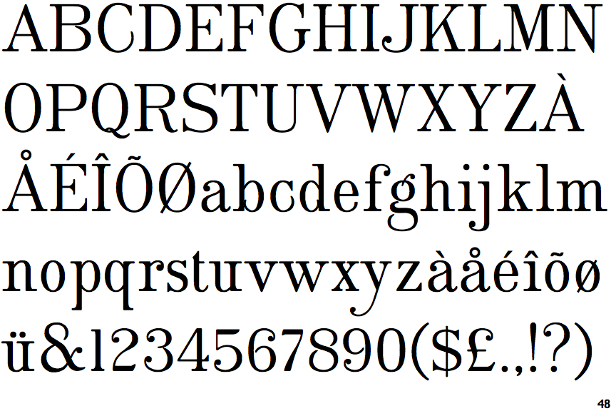
Burin Roman

Crosses
The upper-case 'Q' tail crosses the circle.
Parallel
The verticals of the upper-case 'M' are parallel.
Meets
The centre bar of the upper-case 'P' meets the vertical.
No top serif
The top stroke of the upper-case 'C' has no upward-pointing serif.
Three
The top of the upper-case 'W' has three upper terminals.