 |
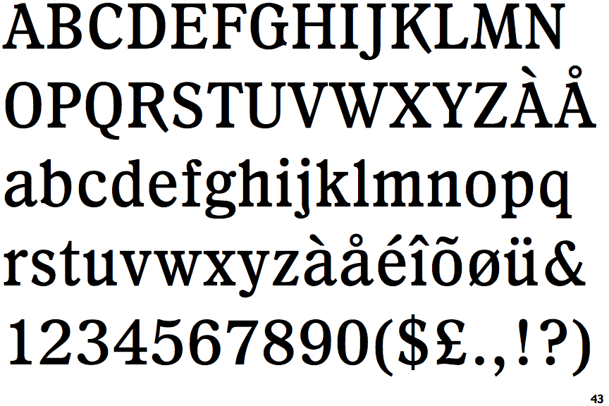
The '&' (ampersand) is traditional style with a gap at the top.
|
 |
The top of the upper-case 'A' has a serif or cusp on the left.
|
 |
The centre bar of the upper-case 'E' has serifs.
|
 |
The upper-case 'G' foot has a forward pointing spur or serif.
|
 |
The tail of the upper-case 'J' has a rounded end or ball.
|
 |
The centre vertex of the upper-case 'W' has two separate serifs.
|
 |
The lower storey of the lower-case 'g' has no gap.
|
 |
The centre bar of the upper-case 'F' has serifs.
|
 |
The stroke of the lower-case 'c' has a rounded end or ball.
|
Note that the fonts in the icons shown above represent general examples, not necessarily the two fonts chosen for comparison.
Show Examples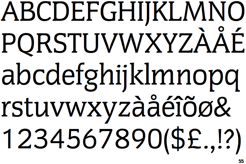
 |
The '&' (ampersand) is traditional style with two enclosed loops.
|
 |
The top of the upper-case 'A' has no serifs or cusps.
|
 |
The centre bar of the upper-case 'E' has no serifs.
|
 |
The upper-case 'G' foot has no spur or serif.
|
 |
The tail of the upper-case 'J' has a tapered end.
|
 |
The centre vertex of the upper-case 'W' has no serifs.
|
 |
The lower storey of the lower-case 'g' has a gap.
|
 |
The centre bar of the upper-case 'F' has no serifs.
|
 |
The stroke of the lower-case 'c' has a flat end or downward-pointing serif.
|