 |
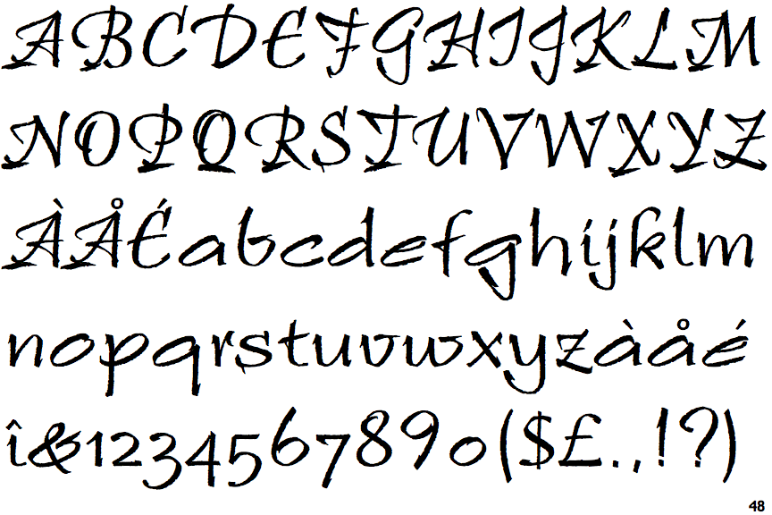
The '&' (ampersand) is traditional style with two enclosed loops.
|
 |
The top storey of the '3' is a smooth curve.
|
 |
The top of the upper-case 'A' has a serif or cusp on the left.
|
 |
The top stroke of the upper-case 'C' has a vertical or angled upward-pointing serif.
|
 |
The 'l' (lower-case 'L') has a right-facing lower serif or tail.
|
 |
The upper-case 'J' has a bar to the left.
|
 |
The upper-case 'E' is drawn as a 'C' with a bar.
|
 |
The lower-case 'i' has a right-facing lower serif or tail.
|
 |
The tail of the upper-case 'T' curves to the left.
|
 |
The upper-case 'I' is a stroke with a flourish on top - not closed.
|
There are more than ten differences; only the first ten are shown.
Note that the fonts in the icons shown above represent general examples, not necessarily the two fonts chosen for comparison.
Show Examples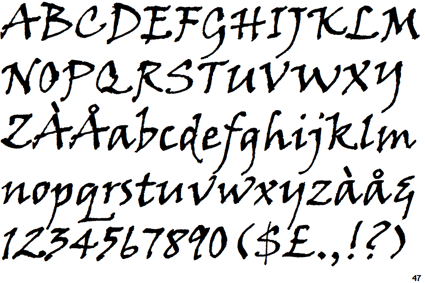
 |
The '&' (ampersand) looks like 'Et' with a gap at the top.
|
 |
The top storey of the '3' is a sharp angle.
|
 |
The top of the upper-case 'A' has no serifs or cusps.
|
 |
The top stroke of the upper-case 'C' has no upward-pointing serif.
|
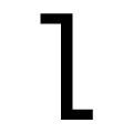 |
The 'l' (lower-case 'L') has a left-facing upper serif and right-facing lower serif or tail.
|
 |
The upper-case 'J' has a bar both sides.
|
 |
The upper-case 'E' is normal letter shape.
|
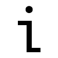 |
The lower-case 'i' has a left-facing upper serif and right-facing lower serif or tail.
|
 |
The tail of the upper-case 'T' is straight.
|
 |
The upper-case 'I' is a single stroke with serifs.
|