 |
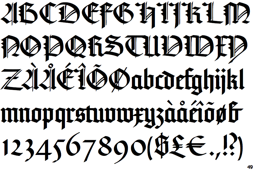
The upper-case 'Q' tail touches the circle.
|
 |
The '&' (ampersand) looks like 'Et' with one enclosed loop (with or without exit stroke).
|
 |
The upper-case 'J' descends below the baseline.
|
 |
The lower-case 'a' stem stops at the top of the bowl (single storey).
|
 |
The strokes of the upper-case 'W' are like two vertical bars and a closing bracket '||)'.
|
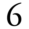 |
The bowl of the '6' leaves a gap with the vertical.
|
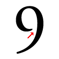 |
The bowl of the '9' leaves a gap with the vertical.
|
Note that the fonts in the icons shown above represent general examples, not necessarily the two fonts chosen for comparison.
Show Examples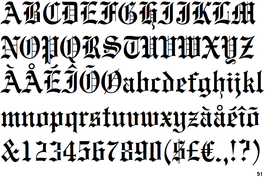
 |
The upper-case 'Q' tail crosses the circle.
|
 |
The '&' (ampersand) is traditional style with two enclosed loops.
|
 |
The upper-case 'J' sits on the baseline.
|
 |
The lower-case 'a' stem curves over the top of the bowl (double storey).
|
 |
The strokes of the upper-case 'W' are like three vertical bars '|||'.
|
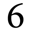 |
The bowl of the '6' meets the vertical.
|
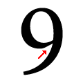 |
The bowl of the '9' meets the vertical.
|