Identifont

Fonts by Appearance

Fonts by Name

Fonts by Similarity

Fonts by Picture

Fonts by Designer/Publisher

Differences

TweetTweet Differences

Compare: and  

Rotation

Rotation

On
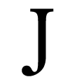
The upper-case 'J' sits on the baseline.
Single
The diagonal strokes of the upper-case 'K' meet at the vertical (with or without a gap).
Round
The top storey of the '3' is a smooth curve.
Ball
The tail of the upper-case 'J' has a rounded end or ball.

Note that the fonts in the icons shown above represent general examples, not necessarily the two fonts chosen for comparison.

Show Examples
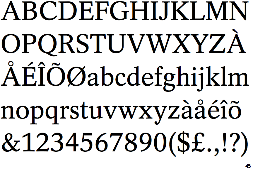
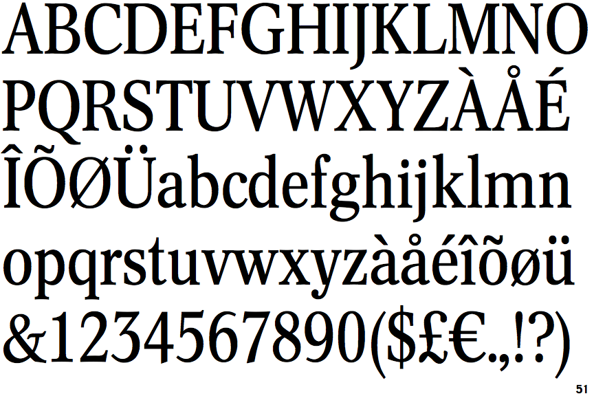
Concorde Nova

Concorde Nova

Below
The upper-case 'J' descends below the baseline.
Bar
The diagonal strokes of the upper-case 'K' connect to the vertical via a horizontal bar.
Angled
The top storey of the '3' is a sharp angle.
Pointed
The tail of the upper-case 'J' has a tapered end.