 |
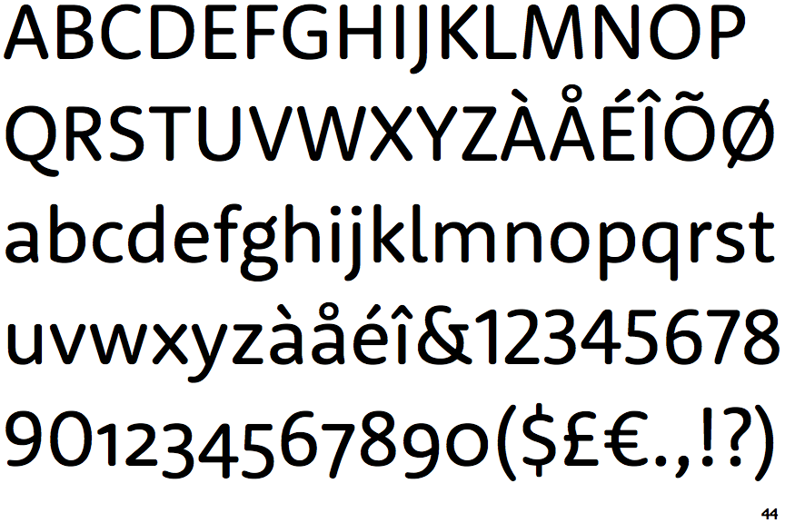
The '&' (ampersand) is traditional style with a gap at the top.
|
 |
The upper-case 'G' has a bar to the left.
|
 |
The 'l' (lower-case 'L') has a right-facing lower serif or tail.
|
 |
The lower-case 'e' has a straight horizontal bar.
|
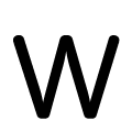 |
The upper-case 'W' vertices are rounded at the top and bottom.
|
Note that the fonts in the icons shown above represent general examples, not necessarily the two fonts chosen for comparison.
Show Examples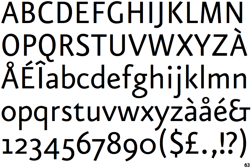
 |
The '&' (ampersand) looks like 'Et' with a gap at the top.
|
 |
The upper-case 'G' has no bar.
|
 |
The 'l' (lower-case 'L') has no serifs or tail.
|
 |
The lower-case 'e' has a straight angled bar.
|
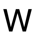 |
The upper-case 'W' vertices are flat at the top and bottom.
|