 |
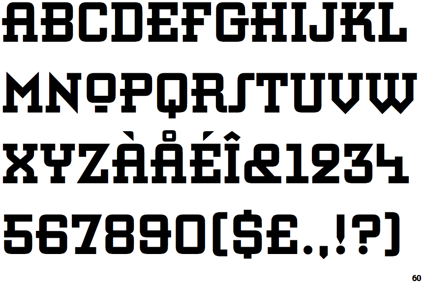
The '4' is open.
|
 |
The centre vertex of the upper-case 'M' is above the baseline.
|
 |
The dot on the '?' (question-mark) is circular or oval.
|
 |
The top storey of the '3' is a sharp angle.
|
 |
The centre bar of the upper-case 'P' crosses the vertical.
|
 |
The upper-case 'A' has parallel verticals.
|
 |
The centre bar of the upper-case 'R' crosses the vertical.
|
 |
The centre vertex of the upper-case 'W' has two separate serifs.
|
 |
The bar of the upper-case 'G' is double-sided.
|
 |
The top vertices of the upper-case 'M' have no top serifs.
|
There are more than ten differences; only the first ten are shown.
Note that the fonts in the icons shown above represent general examples, not necessarily the two fonts chosen for comparison.
Show Examples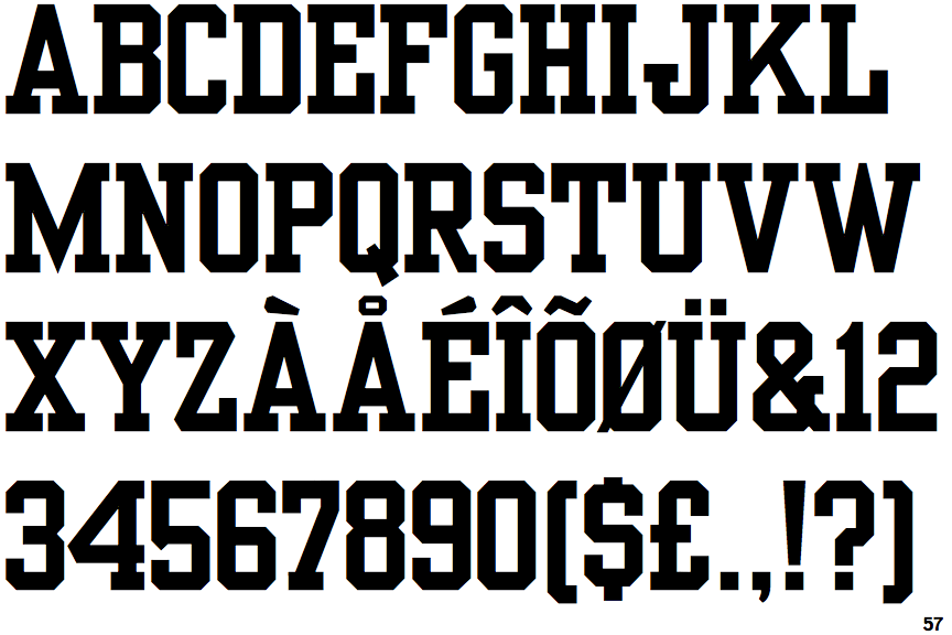
 |
The '4' is closed.
|
 |
The centre vertex of the upper-case 'M' is on the baseline.
|
 |
The dot on the '?' (question-mark) is square or rectangular.
|
 |
The top storey of the '3' is a smooth curve.
|
 |
The centre bar of the upper-case 'P' meets the vertical.
|
 |
The upper-case 'A' has tapered verticals.
|
 |
The centre bar of the upper-case 'R' meets the vertical.
|
 |
The centre vertex of the upper-case 'W' has no serifs.
|
 |
The bar of the upper-case 'G' is single-sided, left-facing.
|
 |
The top vertices of the upper-case 'M' have symmetrical single-sided serifs.
|