 |
The upper-case 'Q' tail touches the circle.
|
 |
The '&' (ampersand) is traditional style with a gap at the top.
|
 |
The diagonal strokes of the upper-case 'K' connect to the vertical via a horizontal bar.
|
 |
The centre vertex of the upper-case 'M' is on the baseline.
|
 |
The lower-case 'g' is double-storey (with or without gap).
|
 |
The centre bar of the upper-case 'E' has serifs.
|
 |
The bar of the upper-case 'G' is double-sided.
|
 |
The leg of the upper-case 'K' has two serifs.
|
 |
The centre bar of the upper-case 'F' has serifs.
|
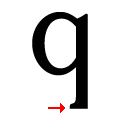 |
The tail of the lower-case 'q' has a single left-facing serif.
|
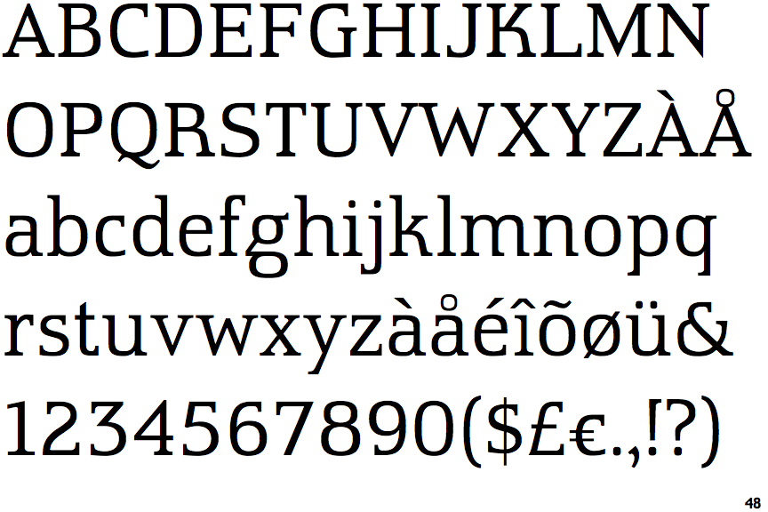
Note that the fonts in the icons shown above represent general examples, not necessarily the two fonts chosen for comparison.
Show Examples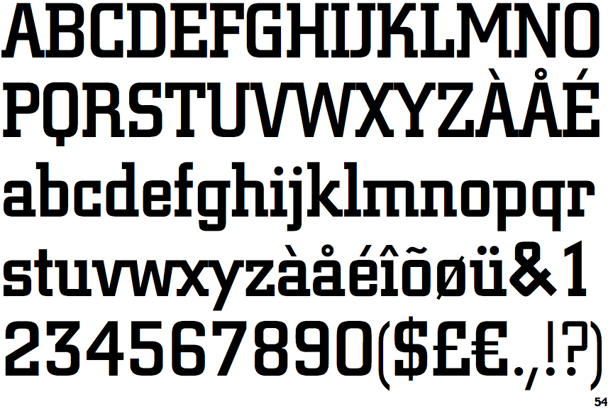
 |
The upper-case 'Q' tail crosses the circle.
|
 |
The '&' (ampersand) is traditional style with two enclosed loops.
|
 |
The diagonal strokes of the upper-case 'K' meet at the vertical (with or without a gap).
|
 |
The centre vertex of the upper-case 'M' is above the baseline.
|
 |
The lower-case 'g' is single-storey (with or without loop).
|
 |
The centre bar of the upper-case 'E' has no serifs.
|
 |
The bar of the upper-case 'G' is single-sided, left-facing.
|
 |
The leg of the upper-case 'K' has a single right-pointing serif or foot.
|
 |
The centre bar of the upper-case 'F' has no serifs.
|
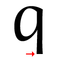 |
The tail of the lower-case 'q' has no serifs.
|