 |
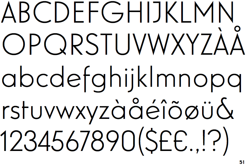
The '&' (ampersand) is traditional style with a gap at the top.
|
 |
The centre vertex of the upper-case 'M' is above the baseline.
|
 |
The top storey of the '3' is a smooth curve.
|
 |
The upper-case 'J' has a bar to the left.
|
 |
The centre bar of the upper-case 'R' meets the vertical.
|
 |
The lower-case 'e' has a straight angled bar.
|
 |
The right side of the upper-case 'G' is curved.
|
 |
The lower-case 'u' has no stem/serif.
|
 |
The tail of the lower-case 'f' descends below the baseline.
|
 |
The tail of the lower-case 'j' is curved with no upper serif.
|
Note that the fonts in the icons shown above represent general examples, not necessarily the two fonts chosen for comparison.
Show Examples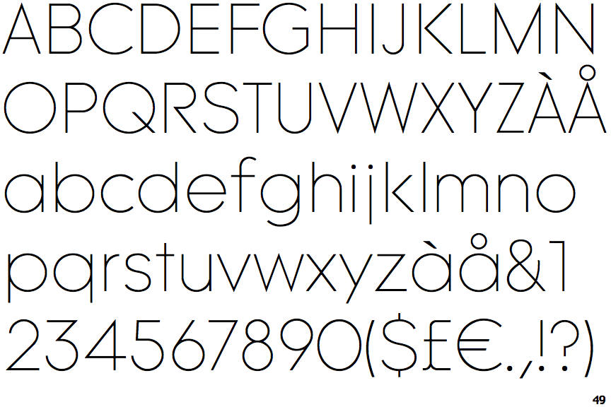
 |
The '&' (ampersand) is traditional style with two enclosed loops.
|
 |
The centre vertex of the upper-case 'M' is on the baseline.
|
 |
The top storey of the '3' is a sharp angle.
|
 |
The upper-case 'J' has no bar.
|
 |
The centre bar of the upper-case 'R' leaves a gap with the vertical.
|
 |
The lower-case 'e' has a straight horizontal bar.
|
 |
The right side of the upper-case 'G' has a flat section.
|
 |
The lower-case 'u' has a stem/serif.
|
 |
The tail of the lower-case 'f' sits on the baseline.
|
 |
The tail of the lower-case 'j' is straight with no upper serif.
|