 |
The upper-case 'Q' tail touches the circle.
|
 |
The strokes are upright.
|
 |
The sides of the lower-case 'y' are angled (V-shaped).
|
 |
The '7' has no bar.
|
 |
The lower-case 'i' has no serifs or tail.
|
 |
The tail of the upper-case 'T' is straight.
|
 |
The upper-case 'I' is a single stroke with no serifs.
|
 |
The tail of the lower-case 'f' sits on the baseline.
|
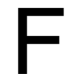 |
The centre bar of the upper-case 'F' meets the vertical.
|
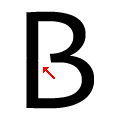 |
The centre bar of the upper-case 'B' leaves a gap with the vertical.
|
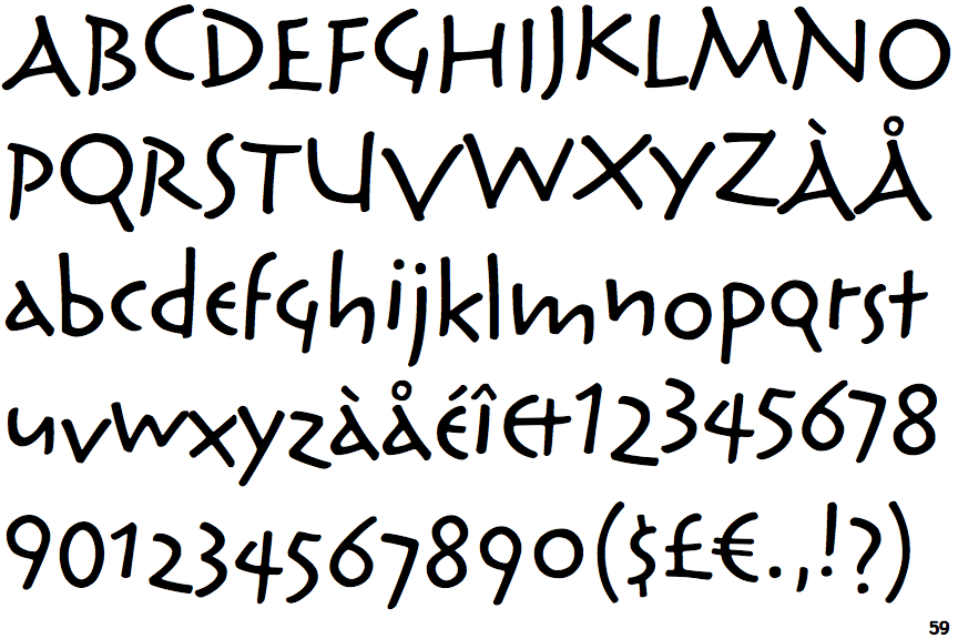
There are more than ten differences; only the first ten are shown.
Note that the fonts in the icons shown above represent general examples, not necessarily the two fonts chosen for comparison.
Show Examples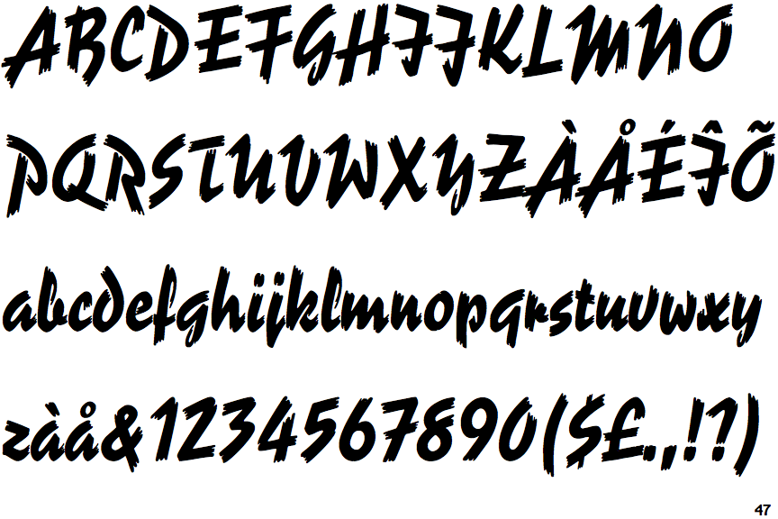
 |
The upper-case 'Q' tail crosses the circle.
|
 |
The strokes are sloped right (italic, oblique, or cursive).
|
 |
The sides of the lower-case 'y' are parallel (U-shaped).
|
 |
The '7' has a bar.
|
 |
The lower-case 'i' has a right-facing lower serif or tail.
|
 |
The tail of the upper-case 'T' curves to the right.
|
 |
The upper-case 'I' is a stroke with a flourish on top - not closed.
|
 |
The tail of the lower-case 'f' descends below the baseline.
|
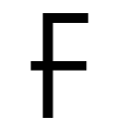 |
The centre bar of the upper-case 'F' crosses the vertical.
|
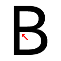 |
The centre bar of the upper-case 'B' meets the vertical.
|