Identifont

Fonts by Appearance

Fonts by Name

Fonts by Similarity

Fonts by Picture

Fonts by Designer/Publisher

Differences

TweetTweet Differences

Compare: and  

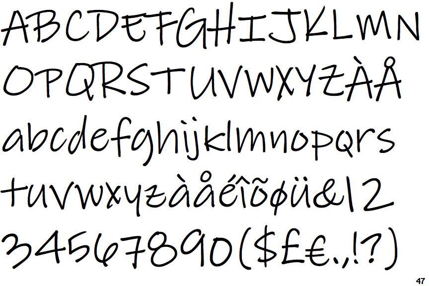
Reenie Beanie

Reenie Beanie

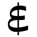
E+line
The '&' (ampersand) looks like an 'E' with a solid or broken line.
No spur
The upper-case 'G' has no spur/tail.
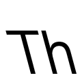
Left
The strokes are sloped left (backslant or linkskursiv).
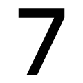
Plain
The '7' has no bar.
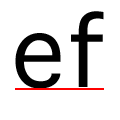
On
The tail of the lower-case 'f' sits on the baseline.

Note that the fonts in the icons shown above represent general examples, not necessarily the two fonts chosen for comparison.

Show Examples
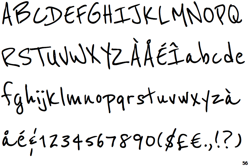
Lindsey Pro

Lindsey Pro

Closed
The '&' (ampersand) is traditional style with two enclosed loops.
Spur
The upper-case 'G' has a spur/tail.
Upright
The strokes are upright.
Bar
The '7' has a bar.
Below
The tail of the lower-case 'f' descends below the baseline.