Differences
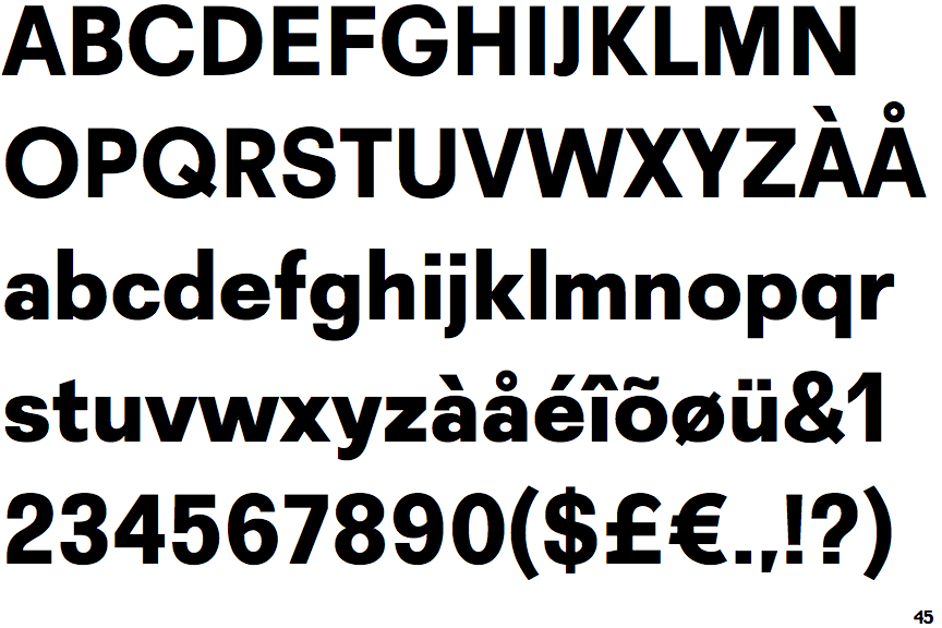
Recta Extra Bold
 |
The upper-case 'J' sits on the baseline.
|
 |
The dot on the '?' (question-mark) is square or rectangular.
|
 |
The verticals of the upper-case 'M' are parallel.
|
 |
The upper-case 'G' has a bar to the left.
|
 |
The dot on the lower-case 'i' or 'j' is square or rectangular.
|
 |
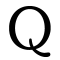
The tail of the upper-case 'Q' is straight.
|
 |
The right side of the upper-case 'G' is curved.
|
Note that the fonts in the icons shown above represent general examples, not necessarily the two fonts chosen for comparison.
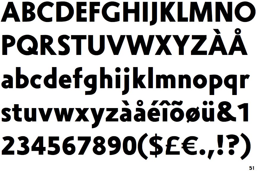
Show ExamplesZeta Bold
 |
The upper-case 'J' descends below the baseline.
|
 |
The dot on the '?' (question-mark) is circular or oval.
|
 |
The verticals of the upper-case 'M' are sloping.
|
 |
The upper-case 'G' has no bar.
|
 |
The dot on the lower-case 'i' or 'j' is circular or oval.
|
 |
The tail of the upper-case 'Q' is curved or S-shaped.
|
 |
The right side of the upper-case 'G' has a flat section.
|

