Differences
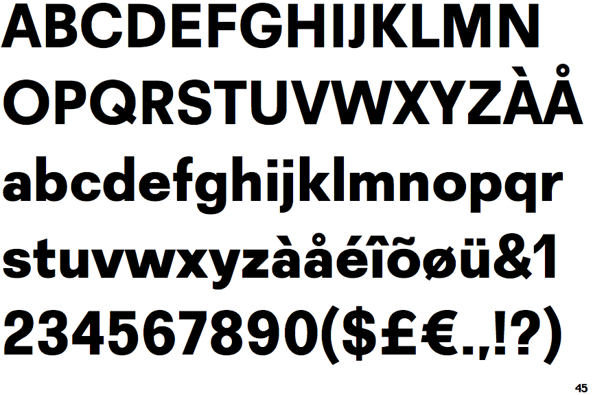
Recta Extra Bold
 |
The '4' is closed.
|
 |
The diagonal strokes of the upper-case 'K' meet at the vertical (with or without a gap).
|
 |
The centre vertex of the upper-case 'M' is on the baseline.
|
 |
The dot on the '?' (question-mark) is square or rectangular.
|
 |
The top storey of the '3' is a smooth curve.
|
 |
The 'l' (lower-case 'L') has no serifs or tail.
|
 |
The dot on the lower-case 'i' or 'j' is square or rectangular.
|
 |
The right side of the upper-case 'G' is curved.
|
 |
The lower-case 'u' has a stem/serif.
|
 |
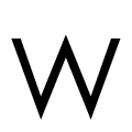
The upper-case 'W' vertices are flat at the top and bottom.
|
Note that the fonts in the icons shown above represent general examples, not necessarily the two fonts chosen for comparison.
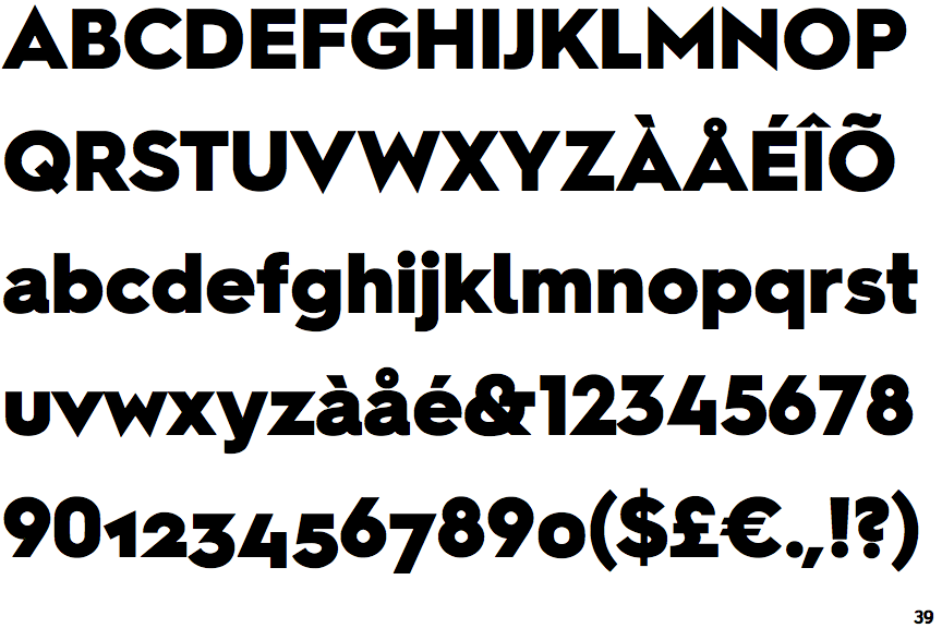
Show ExamplesHurme Geometric Sans 2 Black
 |
The '4' is open.
|
 |
The diagonal strokes of the upper-case 'K' meet in a 'T'.
|
 |
The centre vertex of the upper-case 'M' is above the baseline.
|
 |
The dot on the '?' (question-mark) is circular or oval.
|
 |
The top storey of the '3' is a sharp angle.
|
 |
The 'l' (lower-case 'L') has a right-facing lower serif or tail.
|
 |
The dot on the lower-case 'i' or 'j' is circular or oval.
|
 |
The right side of the upper-case 'G' has a flat section.
|
 |
The lower-case 'u' has no stem/serif.
|
 |
The upper-case 'W' vertices are pointed at the top and bottom.
|

