 |
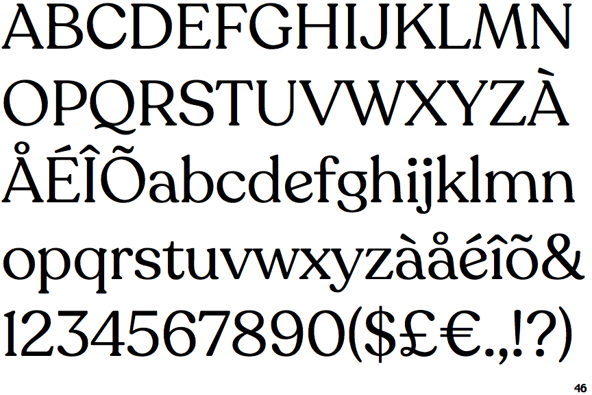
The '&' (ampersand) is traditional style with two enclosed loops.
|
 |
The lower-case 'g' is double-storey (with or without gap).
|
 |
The upper-case 'U' has no stem/serif.
|
 |
The lower-case 'a' stem curves over the top of the bowl (double storey).
|
 |
The top of the upper-case 'A' has a serif or cusp on the left.
|
 |
The upper-case 'G' foot has no spur or serif.
|
 |
The top of the upper-case 'W' has three upper terminals.
|
 |
The sides of the lower-case 'y' are angled (V-shaped).
|
 |
The lower-case 'e' has a straight angled bar.
|
 |
The top vertices of the upper-case 'M' have symmetrical single-sided serifs.
|
There are more than ten differences; only the first ten are shown.
Note that the fonts in the icons shown above represent general examples, not necessarily the two fonts chosen for comparison.
Show Examples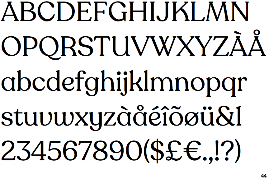
 |
The '&' (ampersand) is traditional style with a gap at the top.
|
 |
The lower-case 'g' is single-storey (with or without loop).
|
 |
The upper-case 'U' has a stem/serif.
|
 |
The lower-case 'a' stem stops at the top of the bowl (single storey).
|
 |
The top of the upper-case 'A' has serifs both sides, or a top bar.
|
 |
The upper-case 'G' foot has a downward pointing spur.
|
 |
The top of the upper-case 'W' has four upper terminals.
|
 |
The sides of the lower-case 'y' are parallel (U-shaped).
|
 |
The lower-case 'e' has a curved bar with no straight segment.
|
 |
The top vertices of the upper-case 'M' have symmetrical double-sided serifs.
|