 |
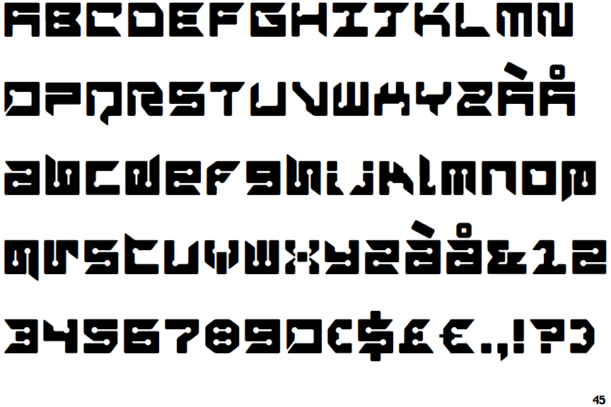
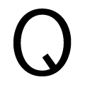
The upper-case 'Q' tail forms part of the stroke of an open circle.
|
 |
The '4' is open.
|
 |
The 'l' (lower-case 'L') has a right-facing lower serif or tail.
|
 |
The upper-case 'J' has a bar both sides.
|
 |
The centre bar of the upper-case 'R' leaves a gap with the vertical.
|
 |
The dot on the lower-case 'i' or 'j' is square or rectangular.
|
 |
The bar of the lower-case 'f' is single-sided.
|
 |
The lower-case 'i' has a right-facing lower serif or tail.
|
 |
The bar of the '4' does not cross the vertical.
|
Note that the fonts in the icons shown above represent general examples, not necessarily the two fonts chosen for comparison.
Show Examples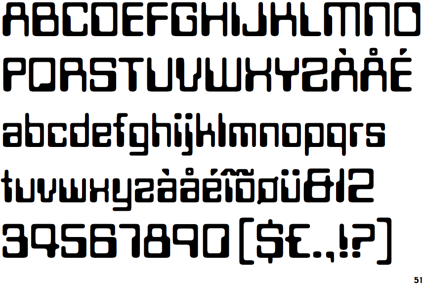
 |
The upper-case 'Q' tail extends into or lies inside the circle.
|
 |
The '4' is closed.
|
 |
The 'l' (lower-case 'L') has no serifs or tail.
|
 |
The upper-case 'J' has no bar.
|
 |
The centre bar of the upper-case 'R' meets the vertical.
|
 |
The dot on the lower-case 'i' or 'j' is circular or oval.
|
 |
The bar of the lower-case 'f' is double-sided.
|
 |
The lower-case 'i' has no serifs or tail.
|
 |
The bar of the '4' crosses the vertical.
|