 |
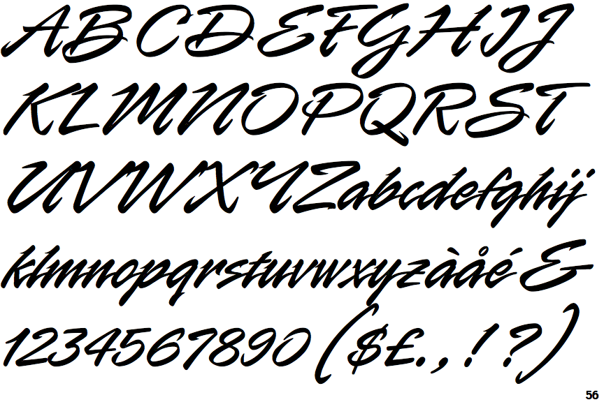
The upper-case 'Q' tail crosses the circle.
|
 |
The '$' (dollar) has a single line crossing the 'S'.
|
 |
The '4' is closed.
|
 |
The centre vertex of the upper-case 'M' is above the baseline.
|
 |
The centre bar of the upper-case 'P' crosses the vertical.
|
 |
The leg of the upper-case 'R' is curved inwards.
|
 |
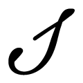
The tail of the upper-case 'T' curves to the right.
|
 |
The tail of the lower-case 'f' sits on the baseline.
|
 |
The lower-case 's' is normal letter shape.
|
 |
The lower-case 'r' is normal letter shape.
|
There are more than ten differences; only the first ten are shown.
Note that the fonts in the icons shown above represent general examples, not necessarily the two fonts chosen for comparison.
Show Examples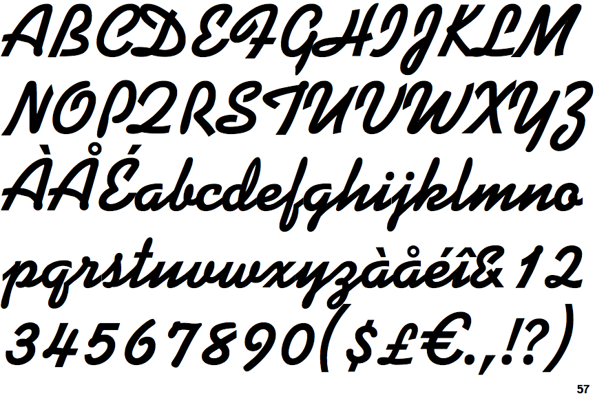
 |
The upper-case 'Q' tail forms part of the stroke of an open circle.
|
 |
The '$' (dollar) has a single line which does not cross the 'S'.
|
 |
The '4' is open.
|
 |
The centre vertex of the upper-case 'M' is on the baseline.
|
 |
The centre bar of the upper-case 'P' leaves a gap with the vertical.
|
 |
The leg of the upper-case 'R' is straight.
|
 |
The tail of the upper-case 'T' is straight.
|
 |
The tail of the lower-case 'f' descends below the baseline.
|
 |
The lower-case 's' is italic script shape.
|
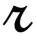 |
The lower-case 'r' is italic script shape.
|