 |
The '&' (ampersand) looks like an 'E' with a solid or broken line.
|
 |
The top storey of the '3' is a smooth curve.
|
 |
The upper-case 'U' has no stem/serif.
|
 |
The upper-case 'G' has double-sided bar.
|
 |
The upper-case 'J' has a bar both sides.
|
 |
The centre bar of the upper-case 'R' crosses the vertical.
|
 |
The strokes are sloped left (backslant or linkskursiv).
|
 |
The right side of the upper-case 'G' is curved.
|
 |
The bar of the lower-case 'f' is single-sided.
|
 |
The upper-case letter 'I' has serifs/bars.
|
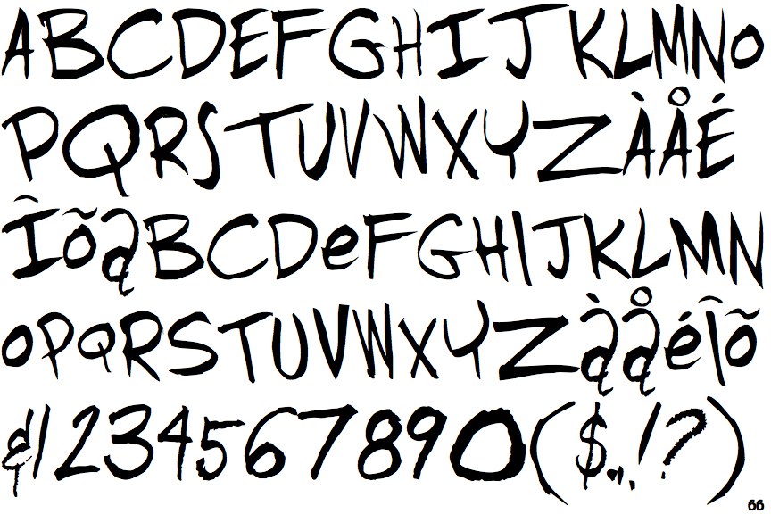
Note that the fonts in the icons shown above represent general examples, not necessarily the two fonts chosen for comparison.
Show Examples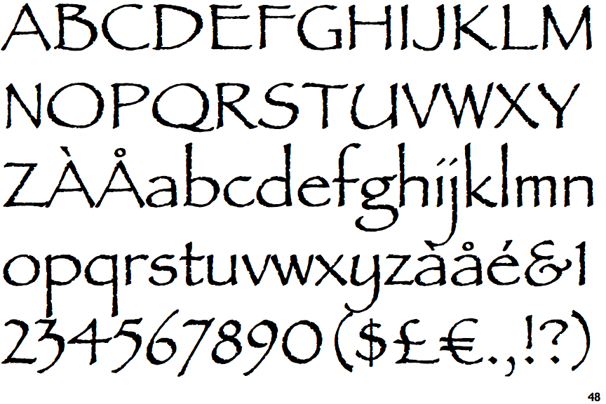
 |
The '&' (ampersand) looks like 'Et' with a gap at the top.
|
 |
The top storey of the '3' is a sharp angle.
|
 |
The upper-case 'U' has a stem/serif.
|
 |
The upper-case 'G' has a bar to the left.
|
 |
The upper-case 'J' has no bar.
|
 |
The centre bar of the upper-case 'R' meets the vertical.
|
 |
The strokes are upright.
|
 |
The right side of the upper-case 'G' has a flat section.
|
 |
The bar of the lower-case 'f' is double-sided.
|
 |
The upper-case letter 'I' is plain.
|