 |
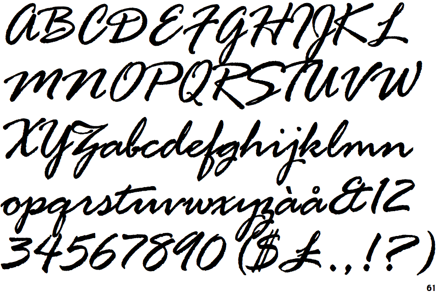
The '$' (dollar) has a double line crossing the 'S'.
|
 |
The '&' (ampersand) looks like 'Et' with one enclosed loop (with or without exit stroke).
|
 |
The upper-case 'J' descends below the baseline.
|
 |
The upper-case 'U' has a stem/serif.
|
 |
The lower-case 'a' stem stops at the top of the bowl (single storey).
|
 |
The upper-case 'G' has a spur/tail.
|
 |
The upper-case 'Y' right-hand arm forms a continuous stroke with the tail.
|
 |
The upper-case 'A' is drawn like a lower-case 'a'.
|
 |
The upper-case 'E' is drawn as a single stroke (with or without loop).
|
 |
The centre bar of the upper-case 'R' crosses the vertical.
|
There are more than ten differences; only the first ten are shown.
Note that the fonts in the icons shown above represent general examples, not necessarily the two fonts chosen for comparison.
Show Examples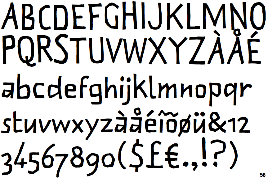
 |
The '$' (dollar) has a single line which does not cross the 'S'.
|
 |
The '&' (ampersand) is traditional style with two enclosed loops.
|
 |
The upper-case 'J' sits on the baseline.
|
 |
The upper-case 'U' has no stem/serif.
|
 |
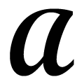
The lower-case 'a' stem curves over the top of the bowl (double storey).
|
 |
The upper-case 'G' has no spur/tail.
|
 |
The upper-case 'Y' arms and tail are separate strokes.
|
 |
The upper-case 'A' has tapered verticals.
|
 |
The upper-case 'E' is normal letter shape.
|
 |
The centre bar of the upper-case 'R' meets the vertical.
|