 |
The dot on the '?' (question-mark) is square or rectangular.
|
 |
The top storey of the '3' is a sharp angle.
|
 |
The centre bar of the upper-case 'R' leaves a gap with the vertical.
|
 |
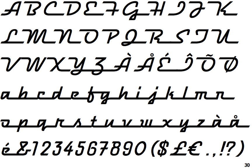
The strokes are sloped right (italic, oblique, or cursive).
|
 |
The dot on the lower-case 'i' or 'j' is square or rectangular.
|
 |
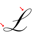
The upper-case 'L' has no loops.
|
Note that the fonts in the icons shown above represent general examples, not necessarily the two fonts chosen for comparison.
Show Examples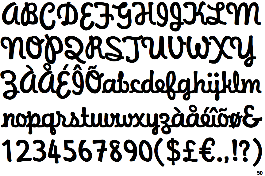
 |
The dot on the '?' (question-mark) is circular or oval.
|
 |
The top storey of the '3' is a smooth curve.
|
 |
The centre bar of the upper-case 'R' meets the vertical.
|
 |
The strokes are upright.
|
 |
The dot on the lower-case 'i' or 'j' is circular or oval.
|
 |
The upper-case 'L' has one upper and one lower loop.
|