 |
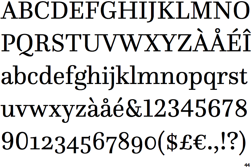
The upper-case 'Q' tail forms part of the stroke of an open circle.
|
 |
The '$' (dollar) has a single line crossing the 'S'.
|
 |
The '&' (ampersand) is traditional style with a gap at the top.
|
 |
The centre bar of the upper-case 'P' leaves a gap with the vertical.
|
 |
The top stroke of the upper-case 'C' has a vertical or angled upward-pointing serif.
|
 |
The upper-case 'G' foot has a downward pointing spur.
|
 |
The tail of the upper-case 'J' has a tapered end.
|
 |
The centre vertex of the upper-case 'W' has two separate serifs.
|
 |
The lower storey of the lower-case 'g' has a gap.
|
Note that the fonts in the icons shown above represent general examples, not necessarily the two fonts chosen for comparison.
Show Examples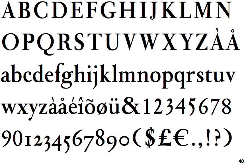
 |
The upper-case 'Q' tail touches the circle.
|
 |
The '$' (dollar) has a double line crossing the 'S'.
|
 |
The '&' (ampersand) is traditional style with two enclosed loops.
|
 |
The centre bar of the upper-case 'P' meets the vertical.
|
 |
The top stroke of the upper-case 'C' has no upward-pointing serif.
|
 |
The upper-case 'G' foot has no spur or serif.
|
 |
The tail of the upper-case 'J' has a rounded end or ball.
|
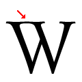 |
The centre vertex of the upper-case 'W' has centre serifs joined to the left serif.
|
 |
The lower storey of the lower-case 'g' has no gap.
|