 |
The '4' is closed.
|
 |
The verticals of the upper-case 'M' are parallel.
|
 |
The upper-case 'G' has no bar.
|
 |
The upper-case 'E' is drawn as a single stroke (with or without loop).
|
 |
The right side of the upper-case 'G' has a flat section.
|
 |
The tail of the lower-case 'y' is curved or U-shaped to the left.
|
 |
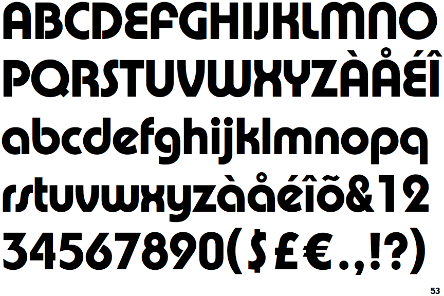
The bar of the upper-case 'A' meets both verticals.
|
 |
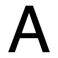
The lower-case 'r' has no spur or serif.
|
 |
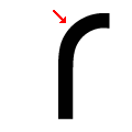
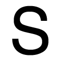
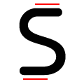
The ends of the upper-case 'S' are curved.
|
 |
The ends of the lower-case 'S' stroke are curved.
|
Note that the fonts in the icons shown above represent general examples, not necessarily the two fonts chosen for comparison.
Show Examples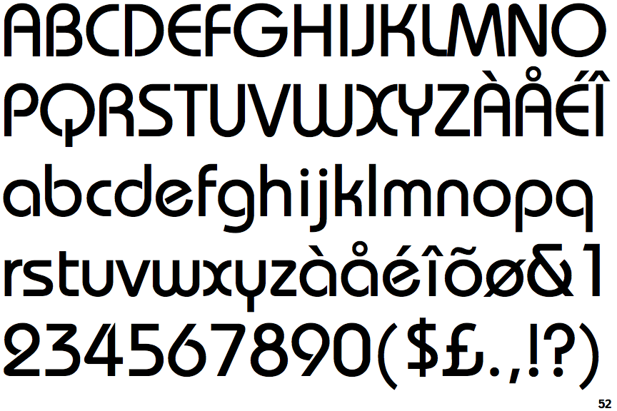
 |
The '4' is open.
|
 |
The verticals of the upper-case 'M' are sloping.
|
 |
The upper-case 'G' has a bar to the left.
|
 |
The upper-case 'E' is drawn as a 'C' with a bar.
|
 |
The right side of the upper-case 'G' is curved.
|
 |
The tail of the lower-case 'y' is substantially straight.
|
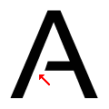 |
The bar of the upper-case 'A' leaves a gap with the left vertical.
|
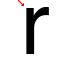 |
The lower-case 'r' has a vertical spur.
|
 |
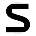
The ends of the upper-case 'S' are straight, horizontal.
|
 |
The ends of the lower-case 'S' stroke are straight, horizontal.
|