Identifont

Fonts by Appearance

Fonts by Name

Fonts by Similarity

Fonts by Picture

Fonts by Designer/Publisher

Differences

TweetTweet Differences

Compare: and  

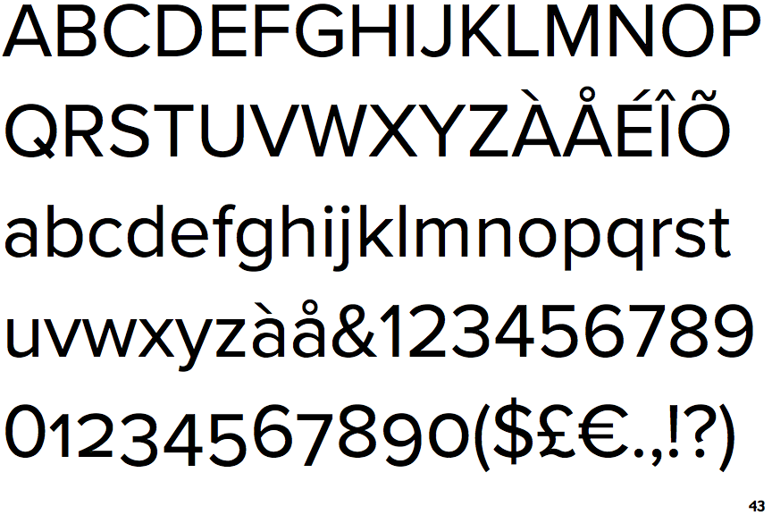
Proxima Nova

Proxima Nova

2-Storey
The lower-case 'a' stem curves over the top of the bowl (double storey).
Plain
The 'l' (lower-case 'L') has no serifs or tail.
V-shaped
The sides of the lower-case 'y' are angled (V-shaped).
Flat
The right side of the upper-case 'G' has a flat section.

Note that the fonts in the icons shown above represent general examples, not necessarily the two fonts chosen for comparison.

Show Examples
Proxima Nova Alternate

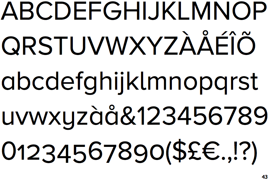
Proxima Nova Alternate

1-Storey
The lower-case 'a' stem stops at the top of the bowl (single storey).
Right
The 'l' (lower-case 'L') has a right-facing lower serif or tail.
U-shaped
The sides of the lower-case 'y' are parallel (U-shaped).
Curved
The right side of the upper-case 'G' is curved.