Identifont

Fonts by Appearance

Fonts by Name

Fonts by Similarity

Fonts by Picture

Fonts by Designer/Publisher

Differences

TweetTweet Differences

Compare: and  

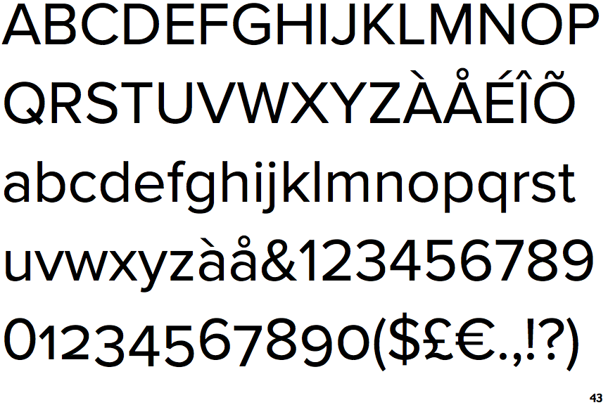
Proxima Nova

Proxima Nova

Baseline
The centre vertex of the upper-case 'M' is on the baseline.
Round
The top storey of the '3' is a smooth curve.
Diagonal
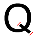
The ends of the upper-case 'Q' tail are both diagonal.

Note that the fonts in the icons shown above represent general examples, not necessarily the two fonts chosen for comparison.

Show Examples
Gotham Rounded

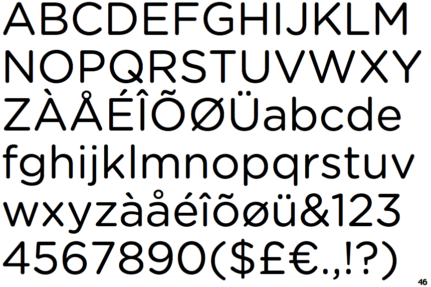
Gotham Rounded

Above
The centre vertex of the upper-case 'M' is above the baseline.
Angled
The top storey of the '3' is a sharp angle.
Rounded
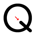
The ends of the upper-case 'Q' tail are rounded.