 |
The '$' (dollar) has a single line which does not cross the 'S'.
|
 |
The diagonal strokes of the upper-case 'K' meet at the vertical (with or without a gap).
|
 |
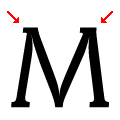
The verticals of the upper-case 'M' are parallel.
|
 |
The centre bar of the upper-case 'E' has serifs.
|
 |
The top of the lower-case 'q' has no spur or serif.
|
 |
The centre vertex of the upper-case 'W' has two separate serifs.
|
 |
The lower storey of the lower-case 'g' has no gap.
|
 |
The top of the '7' has no serif or bar.
|
 |
The centre bar of the upper-case 'F' has serifs.
|
 |
The top vertices of the upper-case 'M' have symmetrical single-sided serifs.
|
There are more than ten differences; only the first ten are shown.
Note that the fonts in the icons shown above represent general examples, not necessarily the two fonts chosen for comparison.
Show Examples
 |
The '$' (dollar) has a single line crossing the 'S'.
|
 |
The diagonal strokes of the upper-case 'K' meet in a 'T'.
|
 |
The verticals of the upper-case 'M' are sloping.
|
 |
The centre bar of the upper-case 'E' has no serifs.
|
 |
The top of the lower-case 'q' has a vertical or slightly angled spur (pointed or flat).
|
 |
The centre vertex of the upper-case 'W' has no serifs.
|
 |
The lower storey of the lower-case 'g' has a gap.
|
 |
The top of the '7' has a downward-pointing serif or bar.
|
 |
The centre bar of the upper-case 'F' has no serifs.
|
 |
The top vertices of the upper-case 'M' have two left-pointing serifs.
|