Identifont

Fonts by Appearance

Fonts by Name

Fonts by Similarity

Fonts by Picture

Fonts by Designer/Publisher

Differences

TweetTweet Differences

Compare: and  

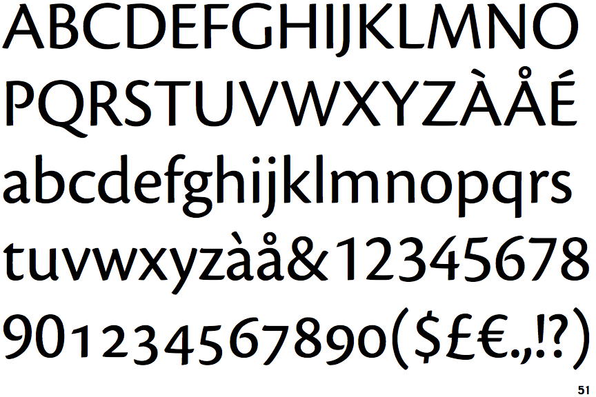
Productus

Productus

Closed
The '4' is closed.
Parallel
The verticals of the upper-case 'M' are parallel.
Meets
The centre bar of the upper-case 'P' meets the vertical.
Straight
The tail of the lower-case 'y' is substantially straight.
Varying
The straight strokes vary in thickness (stressed strokes).

Note that the fonts in the icons shown above represent general examples, not necessarily the two fonts chosen for comparison.

Show Examples
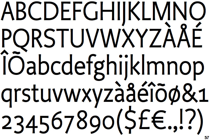
Cronos

Cronos

Open
The '4' is open.
Sloping
The verticals of the upper-case 'M' are sloping.
Gap
The centre bar of the upper-case 'P' leaves a gap with the vertical.
Left
The tail of the lower-case 'y' is curved or U-shaped to the left.
Equal
The straight strokes are constant thickness (unstressed).