Differences
Prima Sans Mono
 |
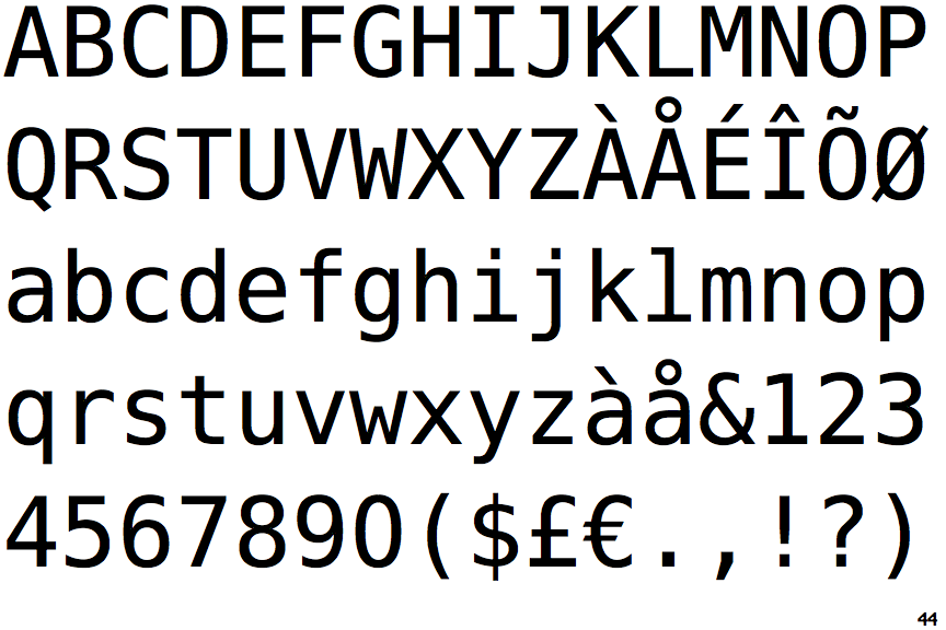
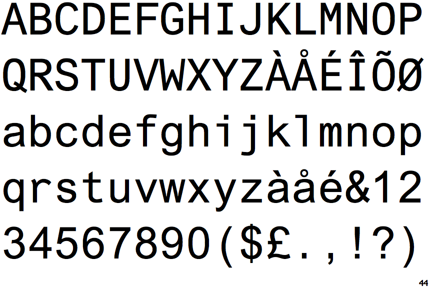
The upper-case 'Q' tail touches the circle.
|
 |
The '&' (ampersand) is traditional style with a gap at the top.
|
 |
The 'l' (lower-case 'L') has a left-facing upper serif and double lower serifs.
|
 |
The upper-case 'J' has a bar to the left.
|
 |
The lower-case 'i' has a left-facing upper serif and double lower serifs.
|
Note that the fonts in the icons shown above represent general examples, not necessarily the two fonts chosen for comparison.
Show Examples