Identifont

Fonts by Appearance

Fonts by Name

Fonts by Similarity

Fonts by Picture

Fonts by Designer/Publisher

Differences

TweetTweet Differences

Compare: and  

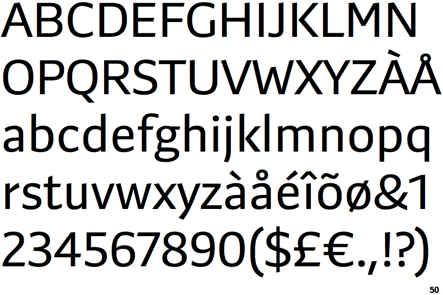
Preto Sans

Preto Sans

On
The upper-case 'J' sits on the baseline.
Above
The centre vertex of the upper-case 'M' is above the baseline.
Parallel
The verticals of the upper-case 'M' are parallel.
Plain
The lower-case 'i' has no serifs or tail.
Below
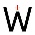
The centre vertex of the upper-case 'W' is below the outer strokes.

Note that the fonts in the icons shown above represent general examples, not necessarily the two fonts chosen for comparison.

Show Examples
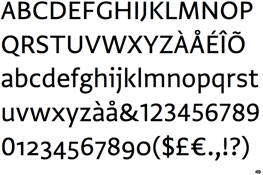
Greta Sans

Greta Sans

Below
The upper-case 'J' descends below the baseline.
Baseline
The centre vertex of the upper-case 'M' is on the baseline.
Sloping
The verticals of the upper-case 'M' are sloping.
One
The lower-case 'i' has a left-facing upper serif.
Cap-Height
The centre vertex of the upper-case 'W' is level with the outer strokes.