Identifont

Fonts by Appearance

Fonts by Name

Fonts by Similarity

Fonts by Picture

Fonts by Designer/Publisher

Differences

TweetTweet Differences

Compare: and  

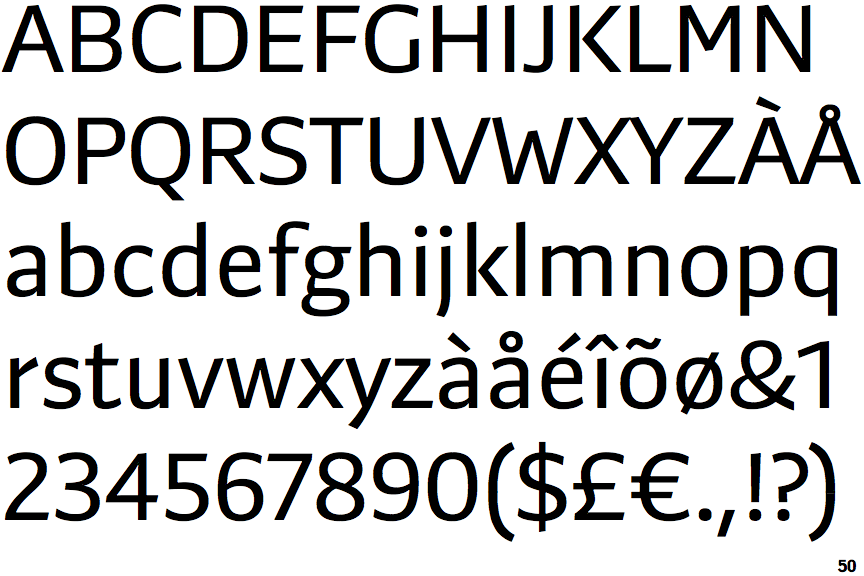
Preto Sans

Preto Sans

Above
The centre vertex of the upper-case 'M' is above the baseline.
Parallel
The verticals of the upper-case 'M' are parallel.
No bar
The upper-case 'G' has no bar.
Missing
The top of the lower-case 'q' has no spur or serif.
Plain
The upper-case letter 'I' is plain.

Note that the fonts in the icons shown above represent general examples, not necessarily the two fonts chosen for comparison.

Show Examples
FS Ingrid

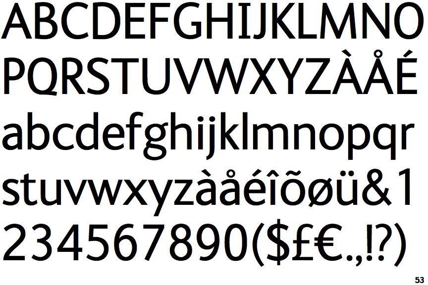
FS Ingrid

Baseline
The centre vertex of the upper-case 'M' is on the baseline.
Sloping
The verticals of the upper-case 'M' are sloping.
Left
The upper-case 'G' has a bar to the left.
Spur
The top of the lower-case 'q' has a vertical or slightly angled spur (pointed or flat).
Serifs
The upper-case letter 'I' has serifs/bars.