 |
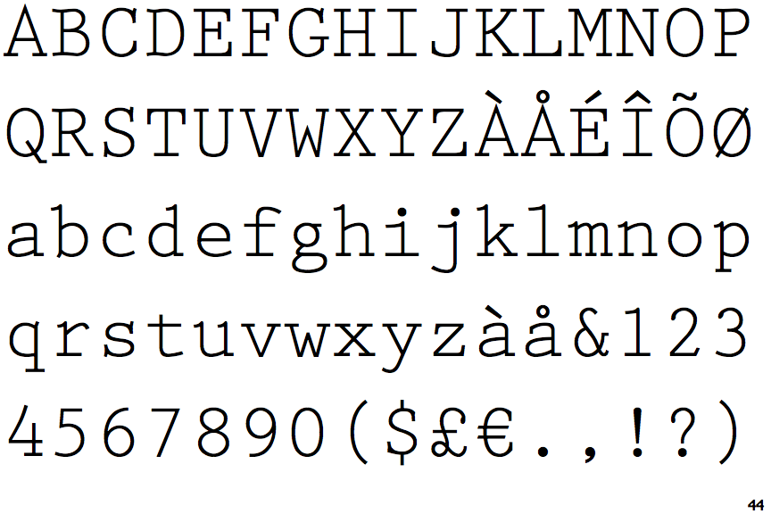
The '$' (dollar) has a single line which does not cross the 'S'.
|
 |
The '&' (ampersand) is traditional style with a gap at the top.
|
 |
The '4' is open.
|
 |
The centre vertex of the upper-case 'M' is above the baseline.
|
 |
The upper-case 'G' foot has no spur or serif.
|
 |
The tail of the upper-case 'J' has a flat end or cusp.
|
 |
The centre vertex of the upper-case 'W' has no serifs.
|
 |
The stroke of the lower-case 'c' has a flat end or downward-pointing serif.
|
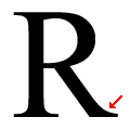 |
The leg of the upper-case 'R' has a single right-pointing serif or foot.
|
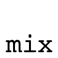 |
The character widths are fixed (monospaced).
|
There are more than ten differences; only the first ten are shown.
Note that the fonts in the icons shown above represent general examples, not necessarily the two fonts chosen for comparison.
Show Examples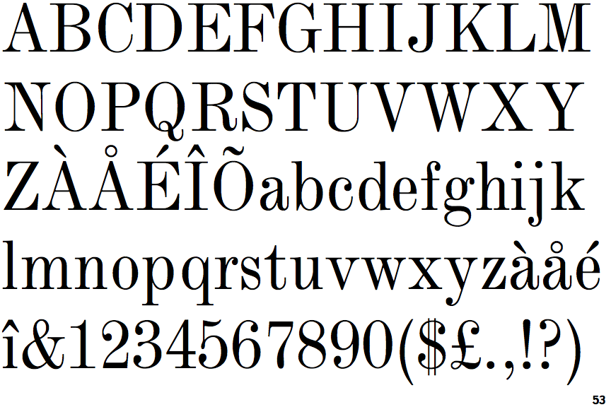
 |
The '$' (dollar) has a double line crossing the 'S'.
|
 |
The '&' (ampersand) is traditional style with two enclosed loops.
|
 |
The '4' is closed.
|
 |
The centre vertex of the upper-case 'M' is on the baseline.
|
 |
The upper-case 'G' foot has a downward pointing spur.
|
 |
The tail of the upper-case 'J' has a rounded end or ball.
|
 |
The centre vertex of the upper-case 'W' has two separate serifs.
|
 |
The stroke of the lower-case 'c' has a rounded end or ball.
|
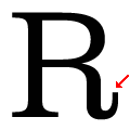 |
The leg of the upper-case 'R' has a vertical or almost vertical spur.
|
 |
The character widths are variable (proportional).
|