 |
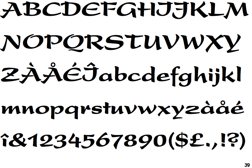
The upper-case 'Q' tail is below and separated from the circle.
|
 |
The '&' (ampersand) is traditional style with two enclosed loops.
|
 |
The upper-case 'J' descends below the baseline.
|
 |
The top storey of the '3' is a smooth curve.
|
 |
The centre bar of the upper-case 'P' leaves a gap with the vertical.
|
 |
The upper-case 'U' has a stem/serif.
|
 |
The upper-case 'Y' right-hand arm forms a continuous stroke with the tail.
|
 |
The upper-case 'J' has a bar both sides.
|
 |
The bar of the '4' crosses the vertical.
|
 |
The centre strokes of the upper-case 'W' meet at a vertex.
|
Note that the fonts in the icons shown above represent general examples, not necessarily the two fonts chosen for comparison.
Show Examples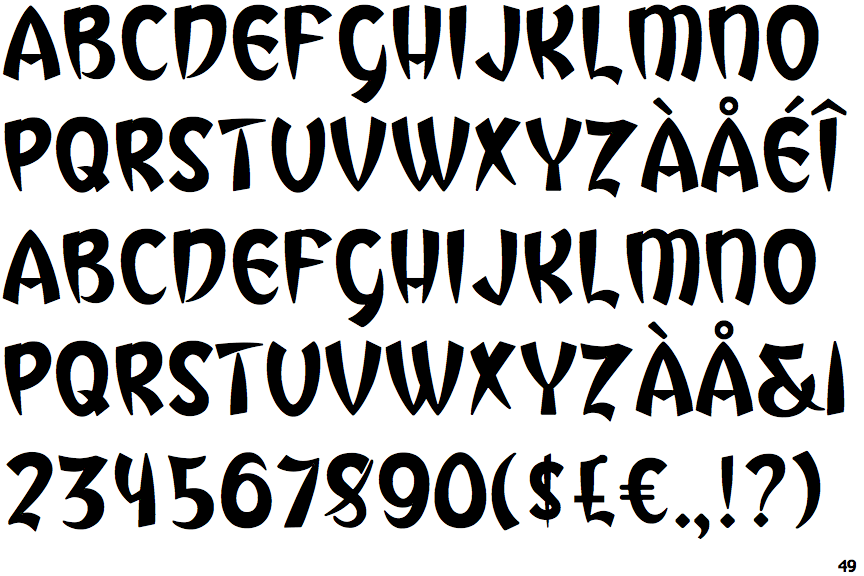
 |
The upper-case 'Q' tail crosses the circle.
|
 |
The '&' (ampersand) is traditional style with a gap at the top.
|
 |
The upper-case 'J' sits on the baseline.
|
 |
The top storey of the '3' is a sharp angle.
|
 |
The centre bar of the upper-case 'P' meets the vertical.
|
 |
The upper-case 'U' has no stem/serif.
|
 |
The upper-case 'Y' arms and tail are separate strokes.
|
 |
The upper-case 'J' has no bar.
|
 |
The bar of the '4' does not cross the vertical.
|
 |
The centre strokes of the upper-case 'W' meet in a T on the left.
|