Identifont

Fonts by Appearance

Fonts by Name

Fonts by Similarity

Fonts by Picture

Fonts by Designer/Publisher

Differences

TweetTweet Differences

Compare: and  

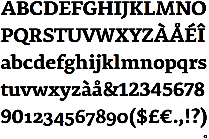
Premiéra Bold

Premiéra Bold

Touches
The upper-case 'Q' tail touches the circle.
Below
The upper-case 'J' descends below the baseline.
Sloping
The verticals of the upper-case 'M' are sloping.
Meets
The centre bar of the upper-case 'P' meets the vertical.
None
The top of the upper-case 'A' has no serifs or cusps.

Note that the fonts in the icons shown above represent general examples, not necessarily the two fonts chosen for comparison.

Show Examples
Messina Serif Bold

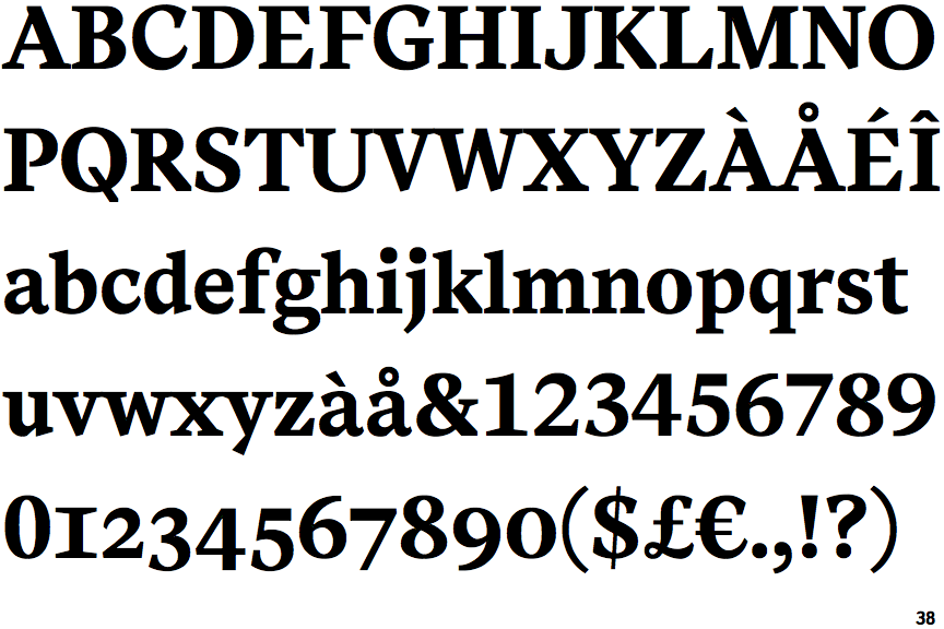
Messina Serif Bold

Crosses
The upper-case 'Q' tail crosses the circle.
On
The upper-case 'J' sits on the baseline.
Parallel
The verticals of the upper-case 'M' are parallel.
Gap
The centre bar of the upper-case 'P' leaves a gap with the vertical.
Left
The top of the upper-case 'A' has a serif or cusp on the left.