 |
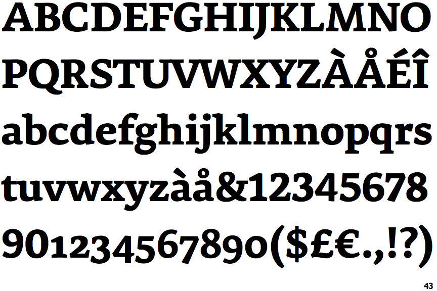
The '&' (ampersand) is traditional style with two enclosed loops.
|
 |
The centre bar of the upper-case 'E' has no serifs.
|
 |
The upper-case 'G' foot has no spur or serif.
|
 |
The top of the lower-case 'q' has no spur or serif.
|
 |
The centre vertex of the upper-case 'W' has no serifs.
|
 |
The top of the '7' has a downward-pointing serif or bar.
|
 |
The centre bar of the upper-case 'F' has no serifs.
|
Note that the fonts in the icons shown above represent general examples, not necessarily the two fonts chosen for comparison.
Show Examples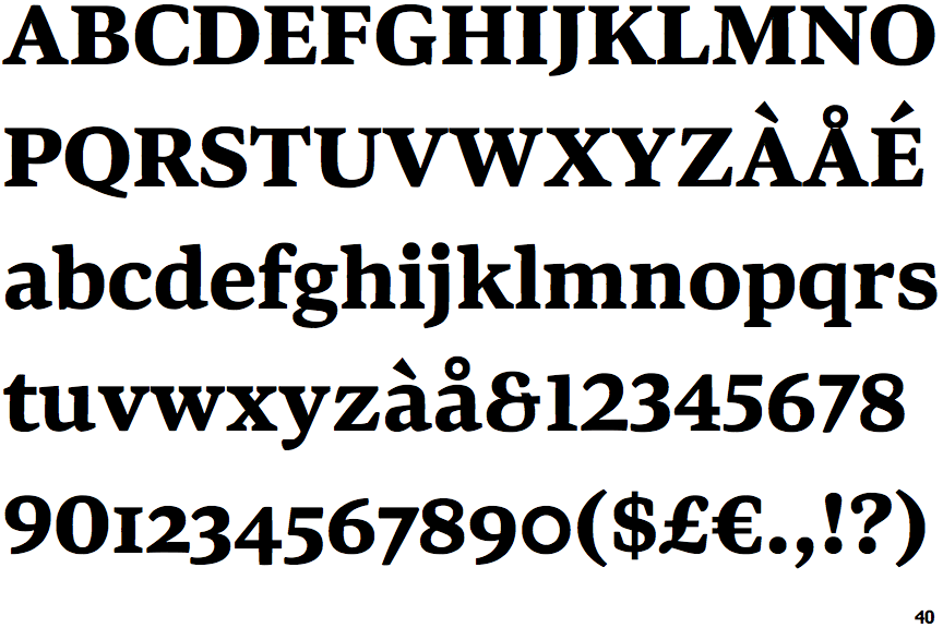
 |
The '&' (ampersand) looks like 'Et' with one enclosed loop (with or without exit stroke).
|
 |
The centre bar of the upper-case 'E' has serifs.
|
 |
The upper-case 'G' foot has a downward pointing spur.
|
 |
The top of the lower-case 'q' has a vertical or slightly angled spur (pointed or flat).
|
 |
The centre vertex of the upper-case 'W' has two separate serifs.
|
 |
The top of the '7' has no serif or bar.
|
 |
The centre bar of the upper-case 'F' has serifs.
|