 |
The verticals of the upper-case 'M' are parallel.
|
 |
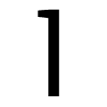
The 'l' (lower-case 'L') has no serifs or tail.
|
 |
The top of the lower-case 'q' has a vertical or slightly angled spur (pointed or flat).
|
 |
The lower-case 'i' has no serifs or tail.
|
 |
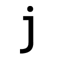
The tail of the lower-case 'j' is curved with no upper serif.
|
Note that the fonts in the icons shown above represent general examples, not necessarily the two fonts chosen for comparison.
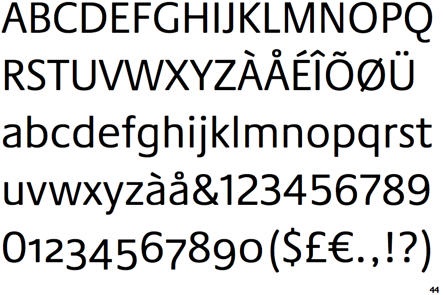
Show Examples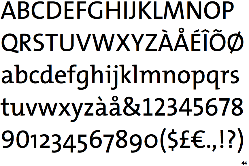
 |
The verticals of the upper-case 'M' are sloping.
|
 |
The 'l' (lower-case 'L') has a left-facing upper serif.
|
 |
The top of the lower-case 'q' has no spur or serif.
|
 |
The lower-case 'i' has a left-facing upper serif.
|
 |
The tail of the lower-case 'j' is curved with an upper serif.
|