Identifont

Fonts by Appearance

Fonts by Name

Fonts by Similarity

Fonts by Picture

Fonts by Designer/Publisher

Differences

TweetTweet Differences

Compare: and  

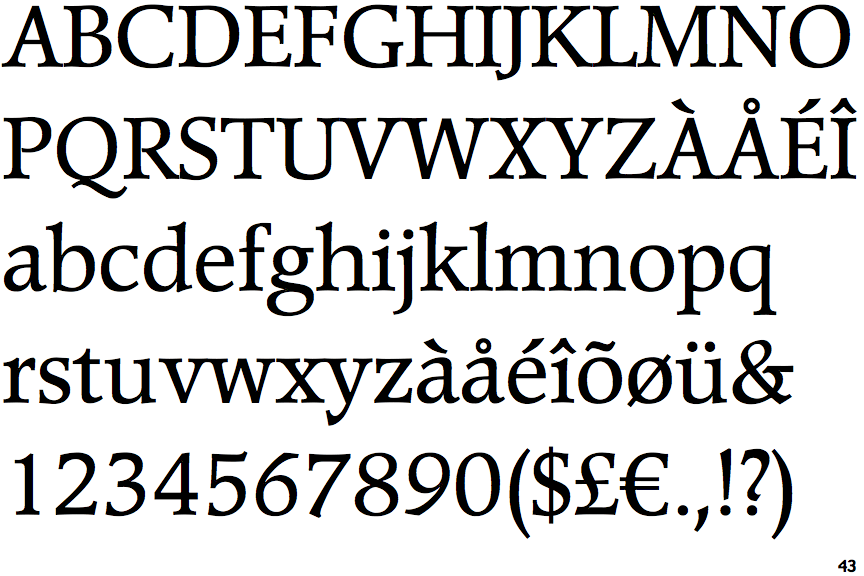
Poppl-Pontifex

Poppl-Pontifex

Double
The diagonal strokes of the upper-case 'K' meet in a 'T'.
None
The top of the upper-case 'A' has no serifs or cusps.
Flat
The tail of the upper-case 'J' has a flat end or cusp.
None
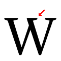
The centre vertex of the upper-case 'W' has no serifs.

Note that the fonts in the icons shown above represent general examples, not necessarily the two fonts chosen for comparison.

Show Examples
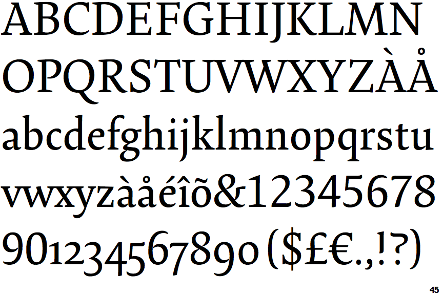
Lirico

Lirico

Single
The diagonal strokes of the upper-case 'K' meet at the vertical (with or without a gap).
Left
The top of the upper-case 'A' has a serif or cusp on the left.
Pointed
The tail of the upper-case 'J' has a tapered end.
Right
The centre vertex of the upper-case 'W' has a single right-facing serif.