Identifont

Fonts by Appearance

Fonts by Name

Fonts by Similarity

Fonts by Picture

Fonts by Designer/Publisher

Differences

TweetTweet Differences

Compare: and  

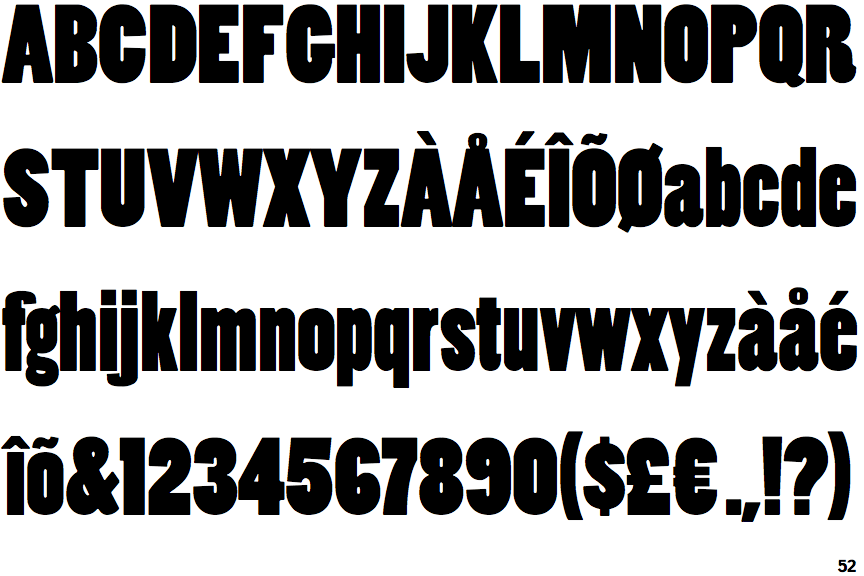
Poplar Black

Poplar Black

Closed
The '&' (ampersand) is traditional style with two enclosed loops.
Baseline
The centre vertex of the upper-case 'M' is on the baseline.
Round
The top storey of the '3' is a smooth curve.
Double
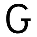
The upper-case 'G' has double-sided bar.

Note that the fonts in the icons shown above represent general examples, not necessarily the two fonts chosen for comparison.

Show Examples
Mostra Three

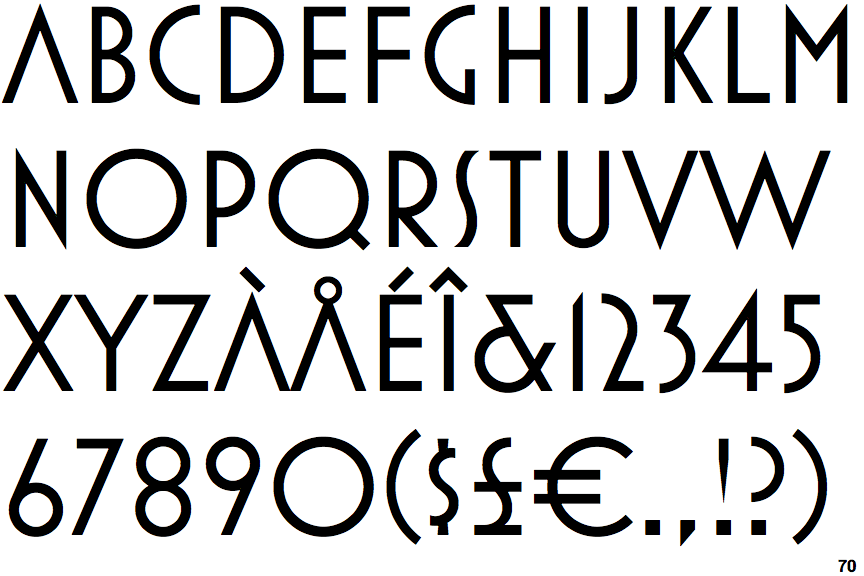
Mostra Three

Open
The '&' (ampersand) is traditional style with a gap at the top.
Above
The centre vertex of the upper-case 'M' is above the baseline.
Angled
The top storey of the '3' is a sharp angle.
No bar
The upper-case 'G' has no bar.