 |
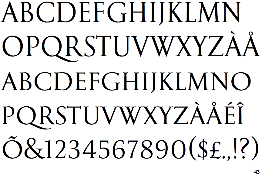
The '&' (ampersand) is traditional style with two enclosed loops.
|
 |
The top storey of the '3' is a smooth curve.
|
 |
The upper-case 'U' has no stem/serif.
|
 |
The centre bar of the upper-case 'E' has serifs.
|
 |
The top of the upper-case 'W' has four upper terminals.
|
 |
The foot of the '4' has double-sided serifs.
|
 |
The centre bar of the upper-case 'F' has serifs.
|
Note that the fonts in the icons shown above represent general examples, not necessarily the two fonts chosen for comparison.
Show Examples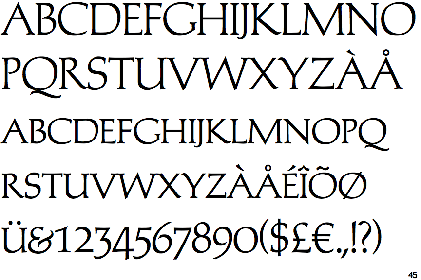
 |
The '&' (ampersand) looks like 'Et' with a gap at the top.
|
 |
The top storey of the '3' is a sharp angle.
|
 |
The upper-case 'U' has a stem/serif.
|
 |
The centre bar of the upper-case 'E' has no serifs.
|
 |
The top of the upper-case 'W' has three upper terminals.
|
 |
The foot of the '4' has no serifs.
|
 |
The centre bar of the upper-case 'F' has no serifs.
|