 |
The upper-case 'Q' tail crosses the circle.
|
 |
The '$' (dollar) has a single line crossing the 'S'.
|
 |
The '&' (ampersand) looks like an 'E' with a solid or broken line.
|
 |
The '4' is open.
|
 |
The top storey of the '3' is a sharp angle.
|
 |
The upper-case 'G' has double-sided bar.
|
 |
The upper-case 'Y' right-hand arm forms a continuous stroke with the tail.
|
 |
The right side of the upper-case 'G' is curved.
|
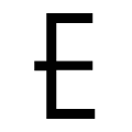 |
The centre bar of the upper-case 'E' crosses the vertical.
|
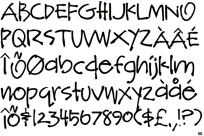
Note that the fonts in the icons shown above represent general examples, not necessarily the two fonts chosen for comparison.
Show Examples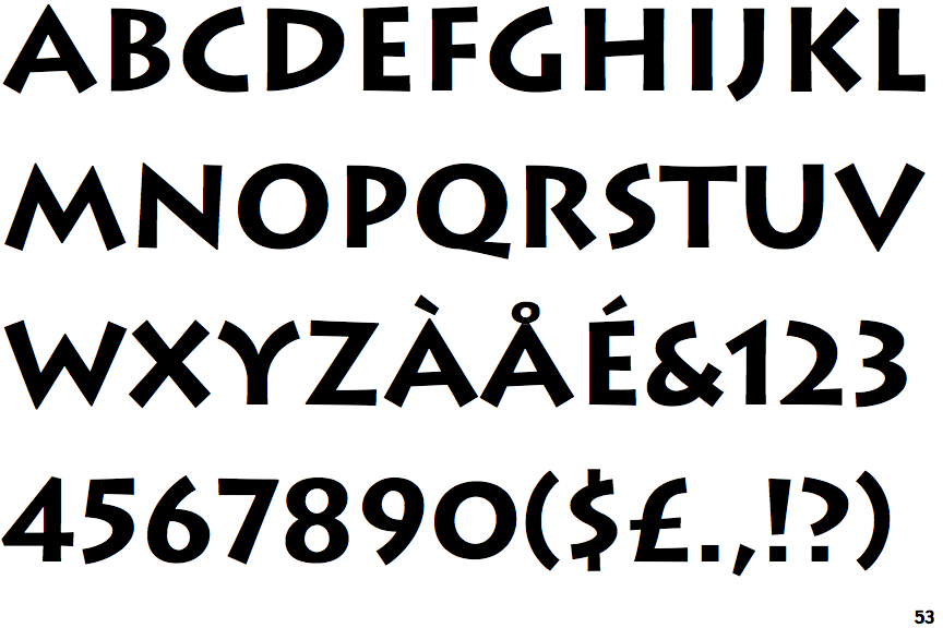
 |
The upper-case 'Q' tail touches the circle.
|
 |
The '$' (dollar) has a single line which does not cross the 'S'.
|
 |
The '&' (ampersand) is traditional style with a gap at the top.
|
 |
The '4' is closed.
|
 |
The top storey of the '3' is a smooth curve.
|
 |
The upper-case 'G' has no bar.
|
 |
The upper-case 'Y' arms and tail are separate strokes.
|
 |
The right side of the upper-case 'G' has a flat section.
|
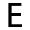 |
The centre bar of the upper-case 'E' meets the vertical.
|