 |
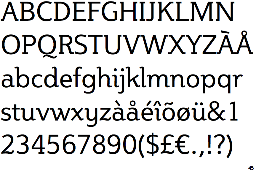
The characters have serifs.
|
 |
The centre vertex of the upper-case 'M' is on the baseline.
|
 |
The top storey of the '3' is a smooth curve.
|
 |
The sides of the lower-case 'y' are parallel (U-shaped).
|
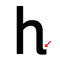 |
The lower-case 'h' has an exit stroke.
|
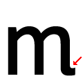 |
The 'm' has an exit stroke.
|
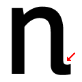 |
The 'n' has an exit stroke.
|
Note that the fonts in the icons shown above represent general examples, not necessarily the two fonts chosen for comparison.
Show Examples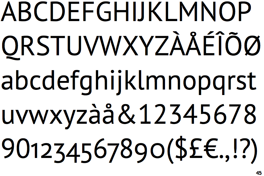
 |
The characters do not have serifs.
|
 |
The centre vertex of the upper-case 'M' is above the baseline.
|
 |
The top storey of the '3' is a sharp angle.
|
 |
The sides of the lower-case 'y' are angled (V-shaped).
|
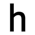 |
The lower-case 'h' has no exit stroke.
|
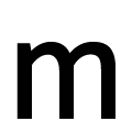 |
The 'm' has no exit stroke.
|
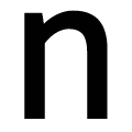 |
The 'n' has no exit stroke.
|