 |
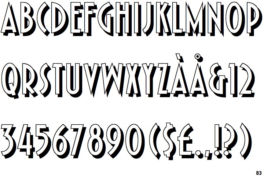
The upper-case 'Q' tail crosses the circle.
|
 |
The '4' is open.
|
 |
The verticals of the upper-case 'M' are parallel.
|
 |
The upper-case 'G' has no spur/tail.
|
 |
The upper-case 'J' has no bar.
|
 |
The strokes are upright.
|
Note that the fonts in the icons shown above represent general examples, not necessarily the two fonts chosen for comparison.
Show Examples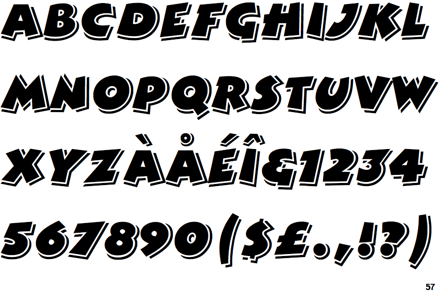
 |
The upper-case 'Q' tail touches the circle.
|
 |
The '4' is closed.
|
 |
The verticals of the upper-case 'M' are sloping.
|
 |
The upper-case 'G' has a spur/tail.
|
 |
The upper-case 'J' has a bar to the left.
|
 |
The strokes are sloped right (italic, oblique, or cursive).
|