 |
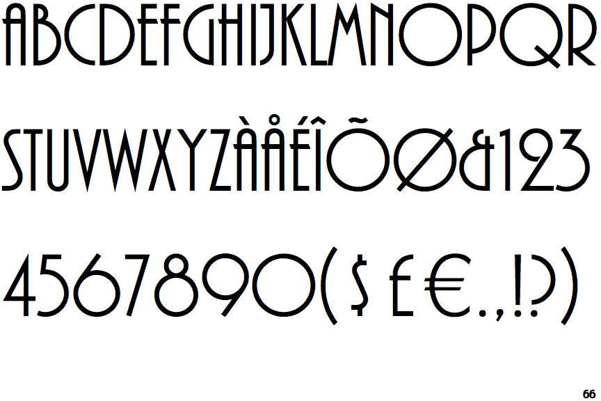
The upper-case 'J' sits on the baseline.
|
 |
The centre vertex of the upper-case 'M' is above the baseline.
|
 |
The upper-case 'J' has a bar to the left.
|
 |
The upper-case 'A' has parallel verticals.
|
 |
The centre bar of the upper-case 'R' meets the vertical.
|
 |
The tail of the upper-case 'Q' is straight.
|
 |
The top of the upper-case 'W' has three upper terminals.
|
Note that the fonts in the icons shown above represent general examples, not necessarily the two fonts chosen for comparison.
Show Examples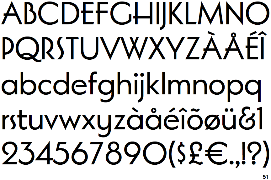
 |
The upper-case 'J' descends below the baseline.
|
 |
The centre vertex of the upper-case 'M' is on the baseline.
|
 |
The upper-case 'J' has no bar.
|
 |
The upper-case 'A' has tapered verticals.
|
 |
The centre bar of the upper-case 'R' leaves a gap with the vertical.
|
 |
The tail of the upper-case 'Q' is curved or S-shaped.
|
 |
The top of the upper-case 'W' has four upper terminals.
|