 |
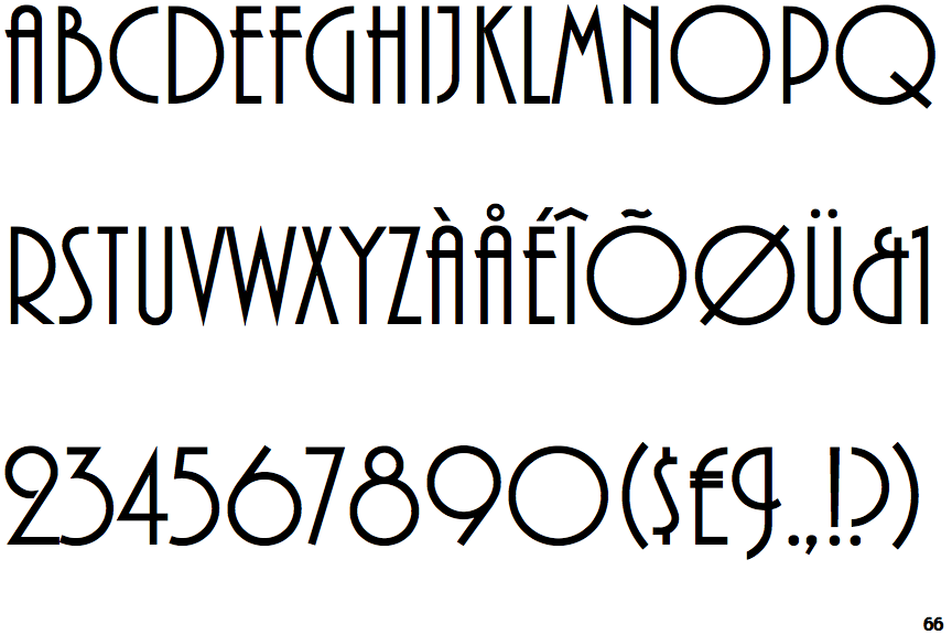
The '$' (dollar) has a single line which does not cross the 'S'.
|
 |
The verticals of the upper-case 'M' are sloping.
|
 |
The top storey of the '3' is a sharp angle.
|
 |
The upper-case 'J' has a bar to the left.
|
 |
The leg of the upper-case 'R' is straight.
|
 |
The upper-case 'A' has parallel verticals.
|
 |
The upper-case 'E' is normal letter shape.
|
 |
The tail of the upper-case 'Q' is straight.
|
Note that the fonts in the icons shown above represent general examples, not necessarily the two fonts chosen for comparison.
Show Examples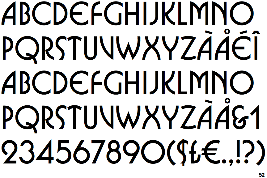
 |
The '$' (dollar) has a single line crossing the 'S'.
|
 |
The verticals of the upper-case 'M' are parallel.
|
 |
The top storey of the '3' is a smooth curve.
|
 |
The upper-case 'J' has no bar.
|
 |
The leg of the upper-case 'R' is curved inwards.
|
 |
The upper-case 'A' has tapered verticals.
|
 |
The upper-case 'E' is drawn as a 'C' with a bar.
|
 |
The tail of the upper-case 'Q' is curved or S-shaped.
|