 |
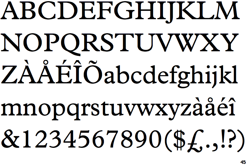
The '$' (dollar) has a double line crossing the 'S'.
|
 |
The diagonal strokes of the upper-case 'K' meet at the vertical (with or without a gap).
|
 |
The verticals of the upper-case 'M' are sloping.
|
 |
The top storey of the '3' is a smooth curve.
|
 |
The centre bar of the upper-case 'P' leaves a gap with the vertical.
|
 |
The top of the upper-case 'A' has a serif or cusp on the left.
|
 |
The top of the upper-case 'W' has four upper terminals.
|
 |
The tail of the upper-case 'J' has a rounded end or ball.
|
Note that the fonts in the icons shown above represent general examples, not necessarily the two fonts chosen for comparison.
Show Examples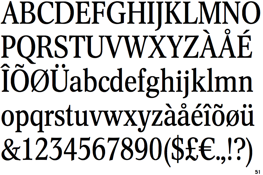
 |
The '$' (dollar) has a single line crossing the 'S'.
|
 |
The diagonal strokes of the upper-case 'K' connect to the vertical via a horizontal bar.
|
 |
The verticals of the upper-case 'M' are parallel.
|
 |
The top storey of the '3' is a sharp angle.
|
 |
The centre bar of the upper-case 'P' meets the vertical.
|
 |
The top of the upper-case 'A' has no serifs or cusps.
|
 |
The top of the upper-case 'W' has three upper terminals.
|
 |
The tail of the upper-case 'J' has a tapered end.
|