 |
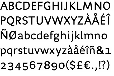
The '&' (ampersand) is traditional style with two enclosed loops.
|
 |
The verticals of the upper-case 'M' are sloping.
|
 |
The lower-case 'g' is double-storey (with or without gap).
|
 |
The 'l' (lower-case 'L') has a right-facing lower serif or tail.
|
 |
The sides of the lower-case 'y' are angled (V-shaped).
|
 |
The bar of the lower-case 'f' is double-sided.
|
 |
The lower-case 'i' has a right-facing lower serif or tail.
|
 |
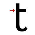
The lower-case 't' has double-sided bar which forms a right-angle with the vertical.
|
Note that the fonts in the icons shown above represent general examples, not necessarily the two fonts chosen for comparison.
Show Examples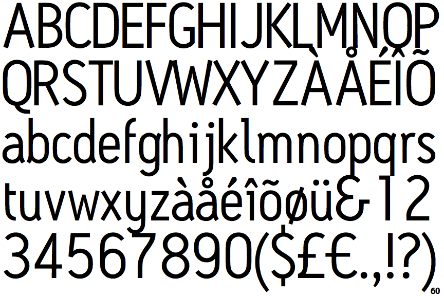
 |
The '&' (ampersand) looks like 'Et' with a gap at the top.
|
 |
The verticals of the upper-case 'M' are parallel.
|
 |
The lower-case 'g' is single-storey (with or without loop).
|
 |
The 'l' (lower-case 'L') has a left-facing upper serif and right-facing lower serif or tail.
|
 |
The sides of the lower-case 'y' are parallel (U-shaped).
|
 |
The bar of the lower-case 'f' is single-sided.
|
 |
The lower-case 'i' has a left-facing upper serif.
|
 |
The lower-case 't' has a single-sided bar.
|